
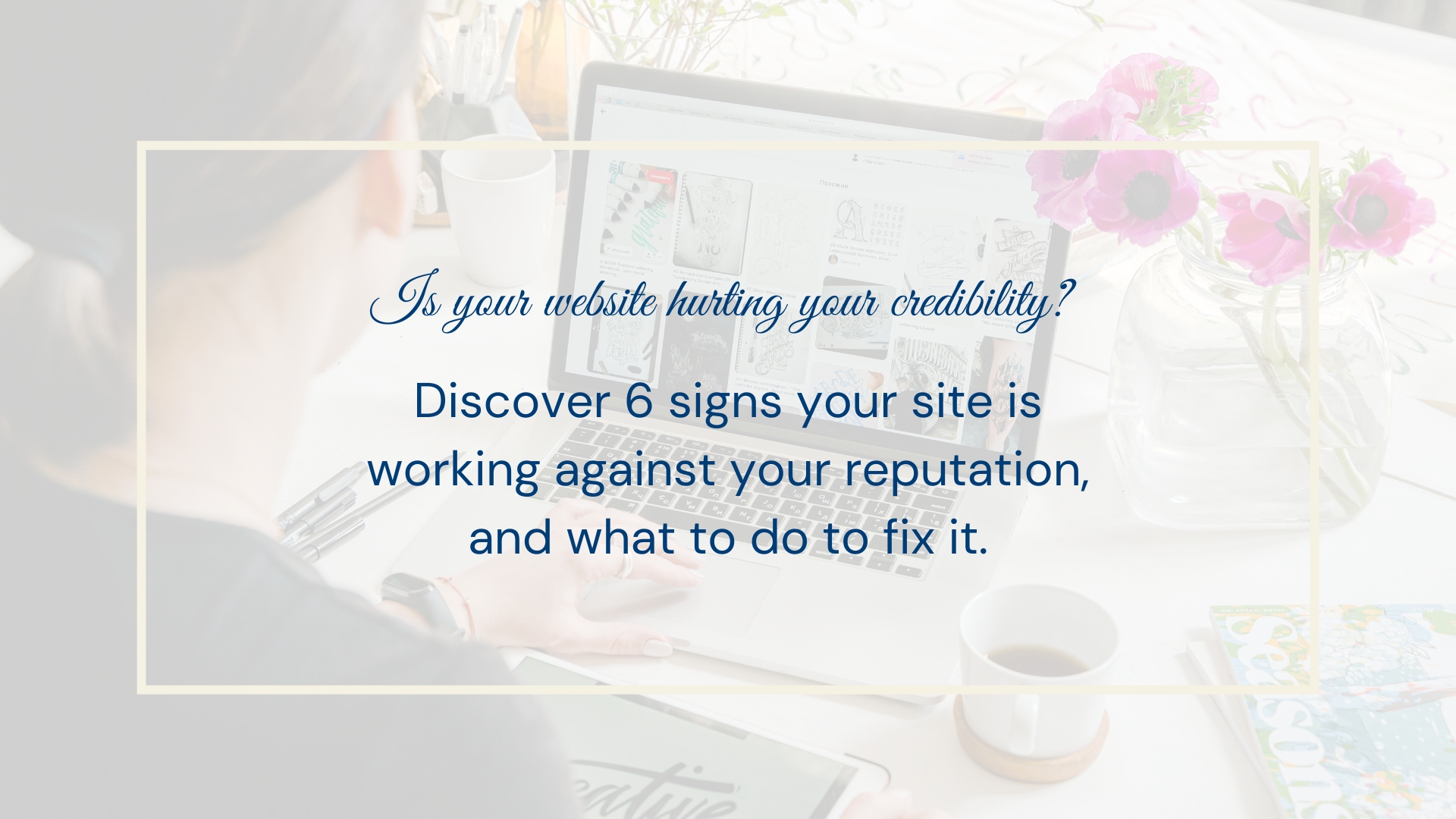
How to Tell If Your Website Is Hurting Your Credibility
You've spent years building a reputation. You've done good work, earned referrals, and grown a business that people trust. But there's a version of this where your website is quietly working against all of that.
I see it more often than you'd expect. A talented professional whose website hasn't kept up with them. The work has grown. The client roster has grown. The experience and results have grown. But the site still looks and reads like it did five years ago, when things were just getting started.
The problem is that most visitors don't know any of that history. They only know what's in front of them. And if what's in front of them doesn't match the level you're actually operating at, they're going to make assumptions, and those assumptions aren't going to work in your favor.
Here are the signs I look for when I'm evaluating whether a website is helping or hurting the person it represents.
The Design Looks Dated
This one is hard to see when it's your own site, because you've been looking at it for years and it just looks normal to you. But design has a shelf life. Certain layouts, font choices, and image styles that looked current in 2018 or 2019 signal to a visitor, at a subconscious level, that this business isn't quite keeping up.
It's not about having the most fashionable website on the internet. It's about whether the visual standard of your site matches the professional standard of your work. If someone is paying you a premium rate for a premium result, your website needs to visually communicate that you belong in that category. If it doesn't, you're asking them to trust you in spite of your first impression instead of because of it.
The Copy Is Vague About What You Actually Do
"I help businesses grow." "Helping you reach your potential." "Your success is my mission."
These kinds of headlines are everywhere, and they communicate almost nothing. A visitor to your site should be able to understand what you do, who you do it for, and what kind of result they can expect within the first few seconds of landing on your page.
If your homepage headline is something a hundred different people in your field could say, it's not working hard enough for you. The more specific you can be about who your work is for and what changes for them when they work with you, the more your right clients will immediately feel like they've found the right person.
I wrote a full breakdown of what each page of your website actually needs to say if you want to go deeper on this. It covers the homepage, about page, services, contact, and the pages most people forget about entirely.
There's No Proof Anywhere
It's one thing to say you're good at what you do. It's another to show it.
Testimonials, case studies, named clients, before-and-after comparisons, specific results. These are the things that make someone think "yes, this person actually delivers." Without them, you're asking visitors to take your word for it, and most people aren't going to do that when they're comparing options.
You don't need a wall of testimonials or an elaborate case study section. Even one or two well-placed pieces of social proof can shift the entire feeling of a page. A quote from a real client, placed near the point on the page where someone is deciding whether to reach out, can do more work than several paragraphs of well-written copy.
It's Clear the Site Is Old
The copyright year in the footer still says 2021. The blog hasn't been updated in two years. The services listed don't match what you're actually offering anymore. There's a "coming soon" section that has been there since launch.
All of these things send a signal, even if no one consciously registers it. They create a quiet sense that the business isn't quite active, or that the person behind it isn't paying attention to the details. For someone who is about to trust you with something that matters to them, that's not a reassuring thing to notice.
A website doesn't need to be updated constantly to feel current. But it does need to reflect where you actually are right now, not where you were when you first launched it.
The Mobile Experience Is an Afterthought
More than half of web traffic happens on mobile. If your site is hard to navigate on a phone, if text is tiny and buttons are hard to tap and forms are frustrating to fill in, a significant portion of the people who find you are getting a broken experience.
This one is especially easy to miss if you mostly check your own website from a desktop. Pick up your phone and go through your site the way a new visitor would. Look at it as if you'd never seen it before. If it's clunky, unclear, or just not pleasant to use, that friction is costing you.
It Takes Too Long to Load
Page speed matters more than most people realize. A few seconds of loading time doesn't sound like much, but it affects whether visitors stay on your page, how search engines rank you, and the overall perception of how professional the experience feels.
You can run a free speed test at PageSpeed Insights from Google to see where your site stands. If the score is low, that's worth addressing, either by optimizing images, cleaning up scripts, or sometimes by reconsidering the platform the site is built on altogether.
What to Do About It
The good news is that most of these issues are fixable. Some of them you can address yourself: updating your copy, adding a testimonial, removing the stale content, checking your mobile view. Others are worth getting professional help with, especially if the design or the technical foundation is what's holding things back.
If you're not sure where to start, my free Ultimate Homepage Checklist walks through every element your homepage should have. It's a quick way to see exactly what's missing or what's not doing the job it should be.
And if after going through this you realize the site needs more than small updates, that's actually a really good thing to know. A website that reflects the level you're at now, built in a way that's easy to maintain and update as you grow, is one of the best investments a solo professional can make. It's the thing that works on your behalf every time someone looks you up, which is more often than you might think.
If you'd like to talk through what a rebuild or refresh would look like for your business, my services page has an overview of how I work, or you can reach out directly and we can start from there.
View other interesting posts


If your expertise has outgrown your online presence, let's talk.
A short call — no pitch, no pressure. I will ask about your work and tell you honestly whether I think I can help.
