
How I Approach Brand Identity and Web Design for Solo Experts and Institutions

A behind-the-scenes look at my process, with real examples from ICTIM, IIMH, Elizabeth Page, Sand Real Estate Group, and more
Every brand project I take on starts with the same uncomfortable question: what happens if we do nothing?
Not "what does the client want the site to look like?" Not "what colours are trending?" But what is the actual cost of staying where they are? A professional register that looks like a wellness blog. A college whose website undersells its faculty. An artist whose portfolio presents work but not the practice behind it. A real estate firm whose site doesn't match the quality of what they sell.
That question shapes everything that follows. Because branding and web design are not decoration. They are the first conversation a business has with a stranger. And that conversation either earns trust or loses it, usually in under five seconds.
Here is how I work through that conversation, phase by phase, with examples from real projects.
Phase 1: Brand Strategy
Most designers skip this step or treat it as a quick form to fill in. I treat it as the most important thing I do on any project.
Brand strategy is the work of understanding who a business is really for, what they uniquely offer, and what the brand needs to communicate before any visual decisions are made. Without it, design is guesswork. With it, every visual decision has a reason.
My strategy process covers four things: purpose and mission, customer personas, market positioning, and the Big Idea. Everything comes from a discovery call and follow-up research, not a questionnaire.
Example from IIMH
The Irish Institute of Medical Herbalists is the professional register for qualified medical herbalists in Ireland. When Rosarie Kingston first came to me, the brief was simple: make it look more professional. But the strategy work revealed something more specific.
The primary visitor is not the general public. It is a healthcare professional, likely a GP or specialist, who is completing the ICTIM Higher Diploma and wants to know what professional life looks like afterwards. She is science-minded, clinically trained, and she will leave in five seconds if the site looks like a wellness brand.
That single insight - identifying Siobhán, as I named the persona - changed everything. The colour palette, the copy, the photography direction, the logo, the page structure. All of it was built around one question- would she take this seriously?
The primary visitor, Dr. Siobhán McCarthy is a GP in her mid-thirties, based in Cork, already enrolled in the ICTIM Higher Diploma part-time. Her question is not "what is herbal medicine?" She already knows. Her question is: if I complete this qualification, will my colleagues take it seriously? She reads every word. She looks for signals of rigour immediately, a named code of ethics, a clear accreditation pathway, factual language, and a direct connection to ICTIM, the institution she already trusts. Anything that looks like a wellness brand loses her in five seconds. What earns her trust is clean lines, specific facts, and a site that looks as serious as she is. When she tells a colleague about IIMH, she says: it looks like the real thing. That was the only brief that mattered.
The positioning work led to a clear Onliness Statement - IIMH is the only professional register for medical herbalists in Ireland that combines clinical, board-level standards with a living connection to native Irish herbal tradition. The Big Idea became three words: Rooted. Rigorous. Recognized.
Example from a tax abatement firm in NYC
For a tax abatement advisory firm in New York, the strategy work started with the same question - who is this really for? The answer was property developers and investors who are leaving significant tax savings on the table because they do not know the abatement programs available to them. The brand values established were transparency, fairness, partnership, precision, and clarity. Two creative directions came from that work: Grounded Warmth and Quiet Authority. The client chose Quiet Authority — a deep navy palette with steel blue and linen accents — because he needed professional credibility to land before anything else.
The strategy session is not glamorous. It involves a lot of listening, a lot of asking why, and a lot of sitting with the answers before touching a single visual. But it is the work that means the design holds together as a system rather than a collection of pretty choices.
Phase 2: Creative Direction
Creative direction is where the strategy becomes visual language. Not a logo yet, not a colour palette yet. A mood. A world. A feeling that, if you got it right, a client can look at and say- yes, that is us.
My process starts with a word dump across four of these - brand character, audience, feeling, and competitors. The words that come out of that exercise guide everything else. Then I research colour, typography, photography style, illustration, graphic texture, and logo style. From that research I build moodboards — usually two or three distinct concepts — each with a name, a rationale, and a clear connection back to the strategy.
Example from ICTIM
The Irish College of Traditional and Integrative Medicine needed a brand that could hold two things at once: the rigour of a medical education programme and the depth of Irish traditional herbal medicine. The creative direction had to feel serious enough for healthcare professionals to trust and rooted enough in tradition to honour what the curriculum actually teaches.
The direction that was chosen used a deep navy and teal palette, referencing the Atlantic and the dark richness of Irish botanical imagery, paired with warm off-whites and a restrained gold accent. Photography pulled from Irish coastal landscapes and clinical learning environments. The typography paired a classical serif with a clean modern sans, bridging the historical and the contemporary.
Example from IIMH
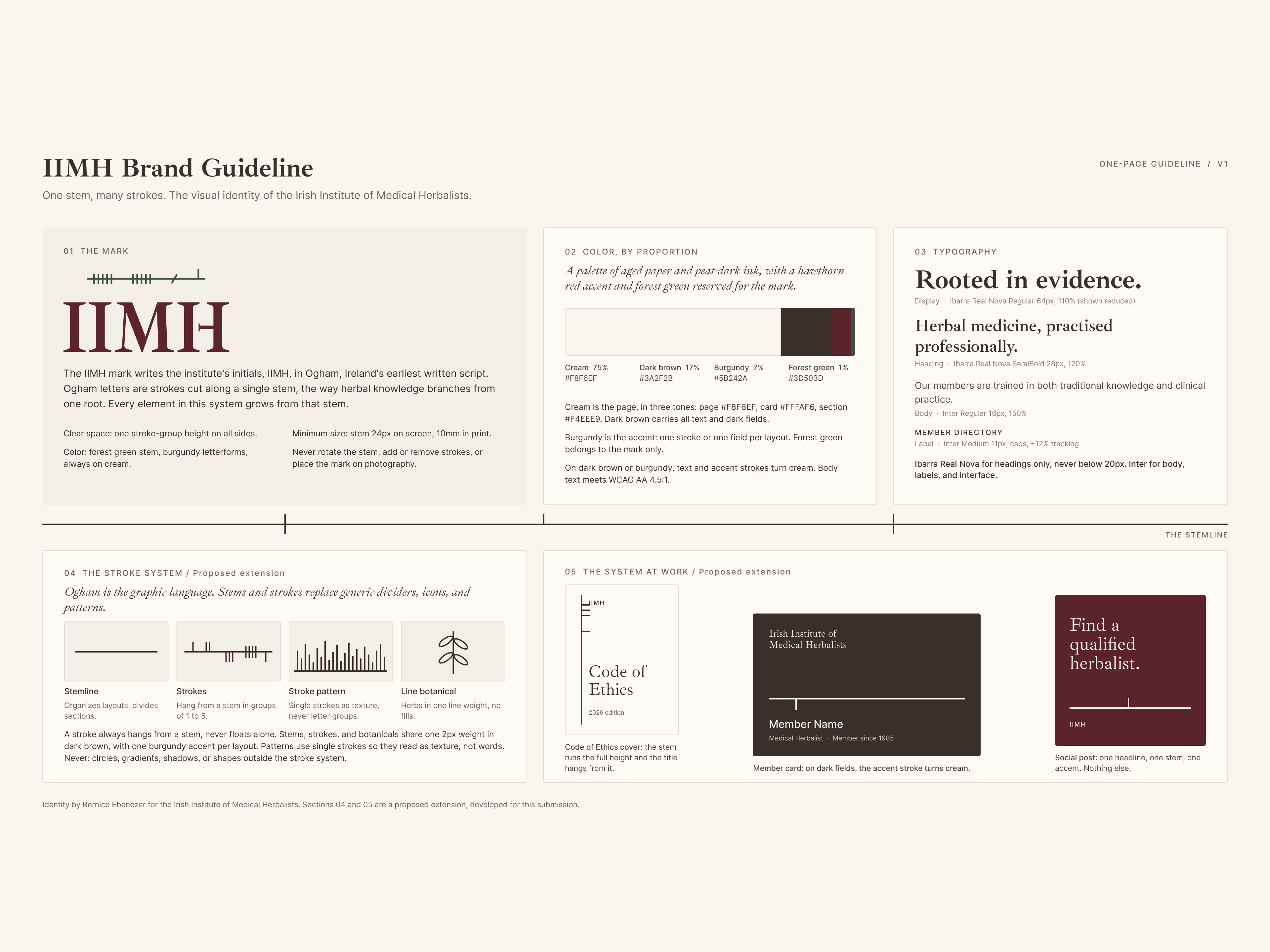
For the IIMH, the creative direction deliberately avoided every obvious Irish visual cliché. No shamrock greens. No Celtic knotwork. No tourist-board coastlines. Instead, colour was pulled from the actual Irish landscape: Hedgerow Green, Atlantic Limestone, Peat, and Amber Resin. Photography was specific to named Irish native plants — Hawthorn, Oak, Gorse, Elder — photographed in natural light at close range. The mood was authoritative, grounded, and quietly proud.
The creative direction stage is where I present concepts to clients with names and rationale, not just visual options. The name matters because it gives the client something to hold onto when making a decision. Choosing Quiet Authority is a different conversation than choosing between palette A and palette B.
Phase 3: Logo Design
Logo design comes after strategy and creative direction, never before. A logo designed without strategy behind it is just a mark. A logo designed after strategy is a compressed version of everything the brand is.
My process starts on paper. I sketch before I open Illustrator. I write out the initials and the full name every way I can think of, explore wordmarks, letterforms, symbols, and combinations, and test ideas at thumbnail size before refining anything. The brand process I follow, learned through Flux Academy's Brand Design Mastery course, requires that every logo works in black and white before colour is introduced, and at favicon scale before it is considered finished.
Example from IIMH
The IIMH logo went through five distinct concept directions before arriving at the final mark. An institutional wordmark, a Hawthorn sprig, an ancient well circle, an illuminated manuscript initial, and an Ogham mark.
Ogham won because it is the right answer, not the interesting one. Ogham is the oldest written form of Irish language, carved on standing stones from the fourth century. Unlike Celtic knotwork or shamrock motifs, Ogham is not decoration. It is language. It is specific. It rewards people who know what they are looking at without demanding attention from those who do not.
The process raised a genuinely interesting question mid-project. Rosarie, the founder, asked whether the Ogham should be written vertically as it appears carved on stone, or horizontally as it appears in Irish manuscripts. It was exactly the right question. We chose the horizontal manuscript form because it is historically accurate for a printed and digital context, and because it scales across a website, a certificate header, a letterhead, and a favicon without losing legibility.
The final mark pairs the horizontal Ogham script in Hedgerow Green above the IIMH wordmark in Ibarra Real Nova — a typeface chosen for its manuscript roots and quiet authority. Hawthorn Berry red for the letterforms. Amber Resin on one Ogham stroke as a finishing detail.
Example from a tax abatement company
Logo development for this firm went through three named concepts. The Keyhole, a building form with a keyhole as negative space. The Magnifying Glass, a building viewed through a lens. The Open Door, an architectural form with doors opening inward.
The client's feedback was direct- none of the three communicated financial benefit clearly enough. The direction that emerged from that conversation was a combination of the skyline quality of the Open Door with the specificity of the Keyhole — a row of buildings where one differentiated building carries a keyhole within it, representing the specific property whose hidden tax benefit is being unlocked.
What matters- simplicity over complexity, scalability to favicon, and conceptual territory that is specific to this brand rather than generic to property or advisory services.
Phase 4: Web Design
Web design is where strategy, creative direction, and logo converge into a working system. A good website is not a collection of sections. It is a journey with a clear question at the start and a clear answer at the end.
My web design process starts with the sitemap and the page flow before I touch any visuals. Who arrives at this page, what do they need to know, and what do I need them to do next? Every section earns its place by answering one of those questions.
Example from IIMH
The IIMH homepage is two pages total — a constraint that became a design strength. Every word had to earn its place. The homepage structure was built around the primary visitor's journey- she arrives asking whether this institution is credible enough to join. The sections answer that question in order. What IIMH is. What standards members are held to. The ethical foundation. What membership includes in practical, specific terms. CPD access. Training through ICTIM. And finally a joining form that accounts for two distinct application paths — ICTIM graduates who apply directly, and graduates of other colleges who complete an entrance assessment.
The membership benefits section needed particular attention because the four benefits are genuinely distinctive: Garda clearance through a nominated body pathway not available to independent practitioners, health insurance reimbursement for patients, full ICTIM library access, and reduced fees on CPD events. These are not soft marketing claims. They are clinically and professionally significant. The design reflected that — clean card layout, no icons, fact-led copy, no fluff.
Example from ICTIM
The ICTIM site had a different challenge. It needed to serve multiple audiences simultaneously: prospective students who are healthcare professionals looking to expand their practice, current students managing their coursework, and the academic community looking to understand the depth of the curriculum. The site architecture separated those journeys cleanly. The homepage spoke to the prospective student. The programme pages went deep on curriculum and clinical standards. The CPD and workshops pages served existing practitioners.
The Webflow build included form-to-MailerLite automation via Make for three forms: Contact, HDCIM Application, and Pre-clinical Application. That integration meant Rosarie and Anna-Maria had a functional lead management system from day one, not just a website.
Example from Sand Real Estate Group
For Sand Real Estate Group, a family-owned firm specialising in presale properties in Israel's most sought-after locations, the primary design problem was scalability. The old site had information but no system. Adding a new development or event meant manually duplicating layouts and editing designs repeatedly.
The redesign built a CMS-driven architecture that made managing new developments and events straightforward for the team without needing a developer for every update. The visual direction was clean and premium, reflecting the quality of the properties they represent, with a Caspio CRM integration maintained from the existing site.
Phase 5: Webflow Development
Development is where the design becomes real. In Webflow, my builds follow Client-First class naming conventions, which means every site I hand over is structured consistently and maintainable by any Webflow developer who picks it up after me.
My standard build process includes responsive testing across desktop, tablet, and mobile at every stage, not as a final check. CMS architecture where needed, set up to be genuinely manageable by the client without developer involvement for routine updates. Third-party integrations including Make, MailerLite, Zapier, Termly or Termageddon, and Google Tag Manager depending on the project's needs. DNS setup and SSL provisioning through the client's registrar, whether that is Blacknight, GoDaddy, or elsewhere.
For ICTIM and IIMH, both Irish-hosted, that meant working with Blacknight's DNS management and setting up Webflow's A records and CNAME correctly. For IIMH specifically, the password-protected members area uses Webflow's native page password function, keeping the build simple without requiring a membership plugin or CMS gating.
For Elizabeth Page, the development centred on an Editorial CMS that could hold both finished works and works in progress, letting her update the site herself as her practice evolved without needing to contact me for every addition.
For Sand Real Estate Group, the development preserved the existing Caspio CRM integration while rebuilding everything else around it — a constraint that required careful planning of the Webflow embed approach.
What runs through all of it
Looking across these projects, the thread that connects them is not a visual style or a type of client. It is a particular kind of brief.
Every one of these clients had something real to communicate and a website that was not communicating it. ICTIM's faculty credentials. IIMH's clinical standing. Elizabeth's evolving practice. Sand's boutique expertise.
The work is always the same underneath: find out who you are really for, understand what they need to feel before they will act, and build something that earns that feeling without wasting a word or a pixel.
The visual decisions follow from that. They do not lead it.
If you are a solo expert, practitioner, or institution whose website is not doing the work it should, I would love to hear about it. The discovery call is free, the conversation is always useful, and the work, when it is right, lasts.
Get in touch or view my services.
If you would like to read these case studies in detail, here are the links to those:
- A case study for a Brand development for a clinical educational institution, ICTIM
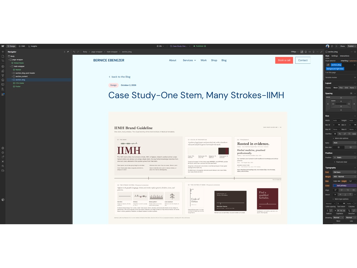
- Read about the development of a Brand Identity for IIMH, a professional medical register in Ireland
- A case study for a membership platform for Elizabeth page, an artist.
View other interesting posts


If your expertise has outgrown your online presence, let's talk.
A short call — no pitch, no pressure. I will ask about your work and tell you honestly whether I think I can help.
