
The Real Reason Most Small Business Homepages Don’t Convert

Most small business websites don’t fail because of bad design.
They fail because they’re unclear.
The fonts may be beautiful.
The layout may be modern.
The animations may be smooth.
But within five seconds of landing on the homepage, visitors are still asking:
- What is this?
- Who is it for?
- What should I do next?
If those questions aren’t answered immediately, conversions drop.
Not because your brand lacks potential.
Not because your offer isn’t strong.
But because clarity is missing.
And clarity always comes before design.
The illusion of a design problem
When founders notice low engagement or poor conversions, the first instinct is usually:
We need a redesign.
So they either change colors, move buttons, update images, add animations, or refresh the layout.
But the results often don’t improve significantly.
Why?
Because design can amplify clarity, but it cannot create it.
If your positioning is vague, your audience undefined, or your message diluted, even the most beautiful design will struggle.
What most small business websites suffer from isn’t a design flaw.
It’s cognitive friction.
What is cognitive friction?
Cognitive friction happens when a visitor has to work too hard to understand your website.
When someone lands on your homepage, their brain is scanning quickly things like:
- Do I belong here?
- Is this relevant to me?
- Does this solve my problem?
- What do I do next?
If the answers aren’t obvious, the brain defaults to the easiest action.
LEAVE.
Confusion creates hesitation.
Hesitation kills momentum.
And lost momentum kills conversions.
The goal of a high-converting homepage is not to impress.
It’s to make understanding effortless.
References:
- Cognitive friction occurs when a user is confronted with an interface or affordance that appears to be intuitive but delivers unexpected results.
- Cognitive Friction is a type of User Friction. In the case of digital products it occurs when the interface, while seemingly intuitive, works contrary to the user's expectations and habits.
The three questions every homepage must answer
Every effective homepage answers three core questions clearly and immediately.
Let’s break them down.
1. What is this?
Your homepage must quickly communicate what category you are in and what you offer.
Not a clever tagline.
Not abstract language.
Not poetic brand statements.
Clarity beats cleverness every time.
Compare these two headlines:
We partner with forward-thinking companies to create engaging websites built with Webflow.
vs.
Webflow websites for small businesses that need more leads and clearer messaging.
The first sounds polished.
The second sounds clear.
When visitors understand what you do within seconds, trust begins to form.
2. Who is it for?
This is where most founders struggle.
Many businesses want to appeal broadly. They fear narrowing their audience because it feels limiting.
So the messaging becomes general. Something like:
We help businesses grow.
We serve startups and enterprises.
We work with all industries.
But when you speak to everyone, no one feels specifically understood.
Specificity builds connection.
If your homepage clearly states,
We design conversion-focused websites for healthcare and wellness brands.
That audience immediately feels seen.
And the right audience doesn’t need convincing.
They need recognition.
3. What should I do next?
Even if your message is clear, conversions stall when there’s no defined next step.
Too many homepages offer the following:
- Book a call
- Download this
- View services
- Read the blog
- Subscribe
- Learn more
All at once.
A strong homepage has a clear hierarchy:
- One primary call to action
- One secondary CTA
The visitor should never wonder what the next step is.
Guidance creates momentum.
Why “Who is it for?” is the hardest question
In conversations with founders, the biggest challenge almost always comes back to audience clarity.
Many businesses hesitate to narrow their focus because they believe broader messaging equals more opportunity.
But the opposite is true.
When your homepage says:
We help entrepreneurs succeed.
It feels safe, but generic.
When it says:
We help service-based founders clarify their message and design websites that convert.
It becomes precise.
Precision attracts alignment.
Founders often think defining their audience will shrink their reach.
In reality, it sharpens their positioning. And sharper positioning increases conversions.
Design cannot compensate for unclear positioning
Here’s something I’ve observed repeatedly:
Teams iterate endlessly on visuals when the friction is actually cognitive.
They test new color palettes.
They move sections around.
They experiment with layouts.
But if the core message is unclear, design changes won’t solve the problem.
Design enhances clarity.
It does not replace it.
A homepage built on strong positioning feels calm and confident.
A homepage built on vague messaging feels busy and scattered.
Before investing in a redesign, clarify the foundation.
Signs your homepage lacks clarity
If you’re unsure whether clarity is your issue, ask yourself:
- Could a first-time visitor explain what you do after five seconds?
- Is your ideal audience clearly named?
- Does your headline describe a result, not just a service?
- Is your primary CTA obvious?
- Does your homepage feel focused or crowded?
If the answers feel uncertain, clarity work may be more important than visual changes.
How to fix homepage clarity
Improving clarity doesn’t require a complete rebuild. It requires strategic thinking.
Here’s where to begin.
1. Define your primary audience
Start with one core audience.
Not three.
Not five.
One.
Ask yourself this:
- Who benefits most from our service?
- Who sees the fastest results?
- Who do we enjoy working with most?
When that audience is clear, messaging becomes sharper automatically.
2. Identify the core problem you solve
What urgent problem brings your audience to your website?
Be specific.
Not:
We help businesses grow.
But:
We help small businesses turn unclear messaging into websites that convert.
Specific problems create stronger positioning.
3. Clarify the transformation
What changes for your client after working with you?
- More qualified leads?
- Clearer positioning?
- Higher conversion rates?
- More confidence in their brand?
State the outcome clearly.
Visitors want transformation, not just services.
4. Simplify your language
Remove buzzwords, abstract phrasing, Industry jargon.
Write as if you are speaking directly to your ideal client in a calm conversation.
Clear language builds trust faster than sophisticated wording.
5. Reduce competing actions
Choose one primary CTA.
Support it with one secondary option.
Everything else can live lower on the page.
Focus improves flow.
Before you redesign, clarify
This is the key shift.
If your homepage isn’t converting, pause before hiring a designer.
Ask:
~Is this a design issue?
~Or a positioning issue?
Most of the time, it’s the latter.
When the audience is clearly defined, the message sharp, and the next step obvious, design becomes easier.
It feels aligned instead of forced.
And that’s when conversion improvements begin.
Why this matters more than ever
In 2026, attention spans are shorter and competition is stronger.
Visitors won’t study or read through your website.
They’ll scan it.
Your homepage must communicate instantly.
Clarity isn’t just a branding exercise.
It’s a conversion strategy.
Some final thoughts
If your homepage feels unclear, it doesn’t mean your business lacks value.
It likely means your positioning needs refinement.
Clarity builds trust.
Trust builds confidence.
Confidence drives action.
And action is what converts.
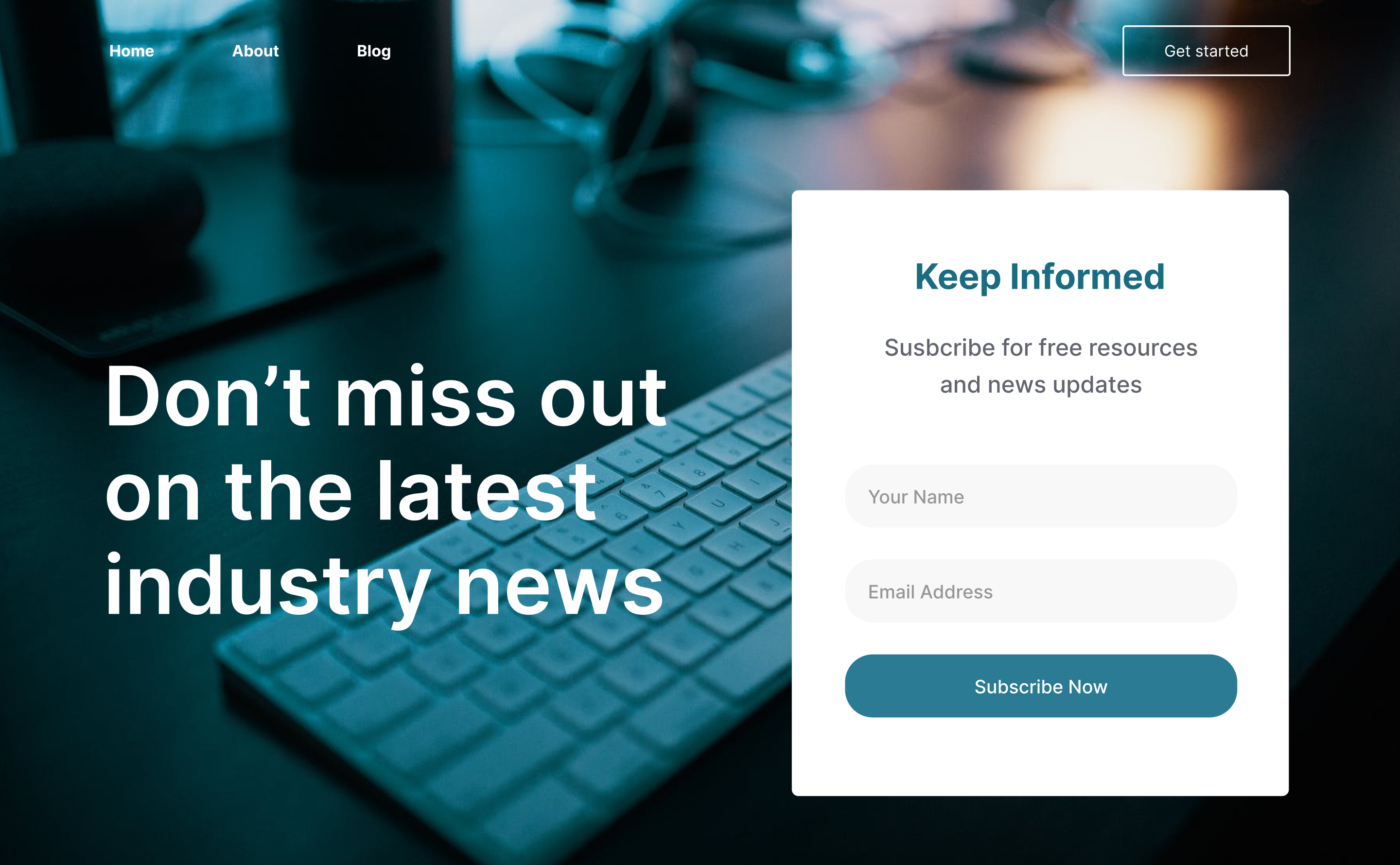
Want help clarifying your homepage?
If this resonated, I created a free resource to help founders structure their homepage with intention:
🎯 The Ultimate Homepage Blueprint Checklist
It walks you through:
- Section structure
- Messaging prompts
- Social proof placement
- CTA hierarchy
- Common clarity mistakes
You can download it here below:
And if you’re ready to go deeper...
I’m currently building The Website Clarity Workbook - a guided framework to help you define your audience, sharpen your positioning, and plan your website before redesigning.
Join the early access list here.
Because before you redesign your website…
Clarity comes first. Join the early access list to the Website Clarity Workbook here.
View other interesting posts


If your expertise has outgrown your online presence, let's talk.
A short call — no pitch, no pressure. I will ask about your work and tell you honestly whether I think I can help.
