
Building a Professional Register for the Irish Institute of Medical Herbalists
Specifics
About the Client
The Irish Institute of Medical Herbalists is a professional organisation supporting qualified medical herbalists in Ireland through Garda vetting, verified standards, professional development, and health insurance recognition.
Project Overview
The Irish Institute of Medical Herbalists, or IIMH, needed a refreshed digital presence that could better communicate its role as a professional body for medical herbalists in Ireland.
The goal was not to create a large educational website or a wellness-style brand. IIMH needed to feel credible, professional, Irish, and clearly connected to the wider ICTIM ecosystem, while still standing on its own as a professional organisation.
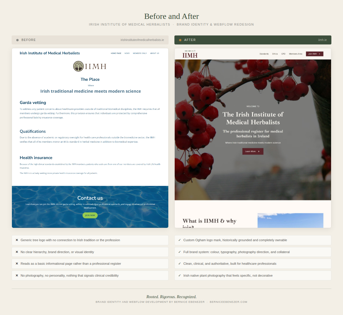
The existing website contained important information about Garda vetting, qualifications, health insurance, and professional development, but the presentation felt limited and did not fully reflect the organisation’s credibility or purpose.
This project included brand strategy, creative direction, logo exploration, website design, and Webflow development.
Problem Description
IIMH sits in a very specific space.
It is connected to Irish traditional medicine and medical herbalism, but it also needs to communicate clinical standards, professional accountability, Garda vetting, biomedical knowledge, and continuing professional development.
That meant the brand could not lean too far into a soft “herbal wellness” aesthetic. At the same time, it could not feel too academic or cold.
The challenge was to create a visual and digital identity that felt:
- professional, but not corporate
- Irish, but not touristy
- connected to herbal medicine, but not overly “herby”
- credible, but still warm
- aligned with ICTIM, but not a duplicate of it
Rosari and Anna-Maria were clear that the site should follow the clean lines of the ICTIM website, but in a more scaled-down way. They wanted the IIMH site to be simple, factual, and easy to understand.
Solution
Discovery & Brand Strategy
Before beginning the design, I started by clarifying the strategic role of the IIMH brand.
The website needed to serve two main audiences.
The first audience was prospective ICTIM students. These visitors may be considering training in herbal medicine and want to understand what professional registration or professional standing looks like after qualification. For them, the IIMH site needed to build confidence and legitimacy.
The second audience was existing IIMH members. These users needed a simple way to access member-only information, CPD resources, professional updates, and relevant articles.
Through the discovery process, the core positioning became clear:
IIMH is not primarily a course provider. It is a professional body that supports standards, qualifications, Garda vetting, CPD, and professional accountability for medical herbalists in Ireland.
This distinction shaped the entire direction of the brand and website.
Strategic Direction
The guiding idea for the brand became:
Rooted. Rigorous. Recognized.
This idea brought together three important parts of IIMH’s identity.
“Rooted” speaks to Irish traditional medicine, native plants, and the cultural depth of herbal practice in Ireland.
“Rigorous” speaks to clinical training, Garda vetting, professional liability insurance, MSc-level standards, and biomedical expertise.
“Recognized” speaks to professional standing, health insurance recognition, and the credibility IIMH provides to its members.
This strategic idea helped prevent the design from becoming generic. Every visual decision needed to support the balance between tradition and professionalism.
Competitive Context
The project also considered the wider competitive and reference landscape.
The National Institute of Medical Herbalists in the UK was discussed as a comparable organisation, but its visual style felt too herbal for the direction IIMH wanted.
Core College was also discussed as a strong Irish competitor with a polished, commercial presence and strong business optics. IIMH did not need to copy that approach, but it did need to feel credible and intentional enough to stand confidently beside other organisations in the space.
The opportunity for IIMH was to own a quieter, more professional position: a clean, Irish, standards-led identity rooted in medical herbalism.
Creative Direction
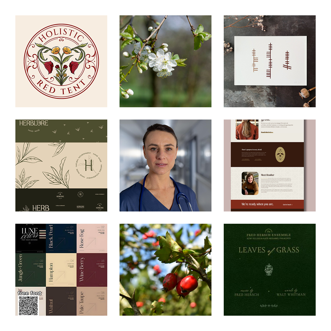
With the strategy signed off, I moved into creative direction. The word dump covered four columns, brand character, audience, feeling, and competitors. The words that kept coming up were grounded, authoritative, quietly proud, clean, and distinctly Irish without being tourist-board.
The competitors were NIMH in the UK, a well-established but overly herby organisation, and Core College in Ireland, a sharp and commercially aggressive operation that has moved away from traditional herbalism. IIMH sits between them, more clinically serious than NIMH, more rooted in Irish tradition than Core College.
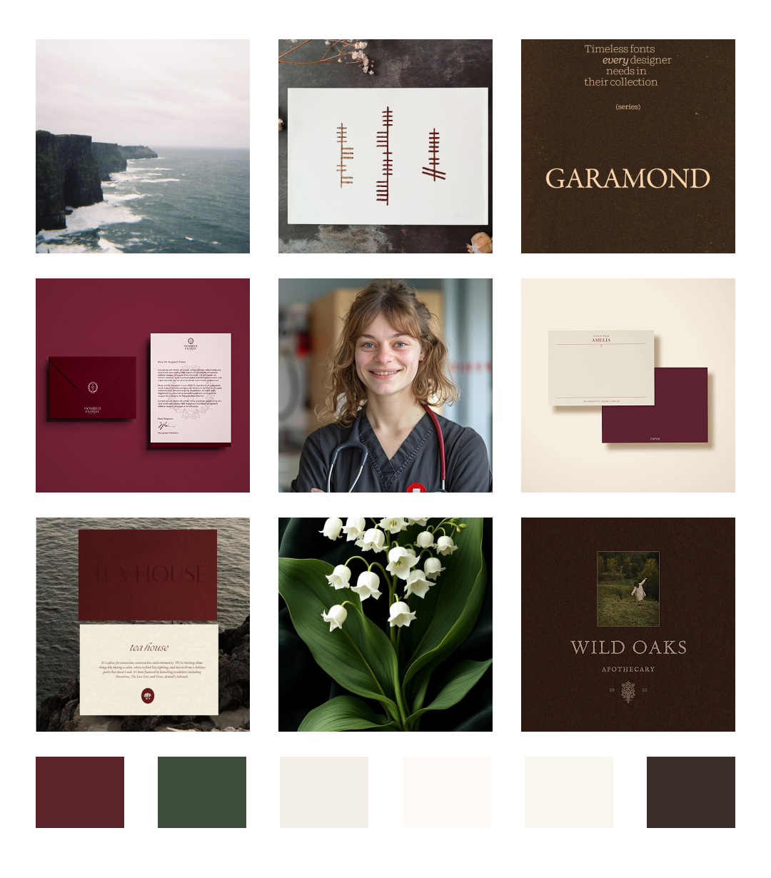
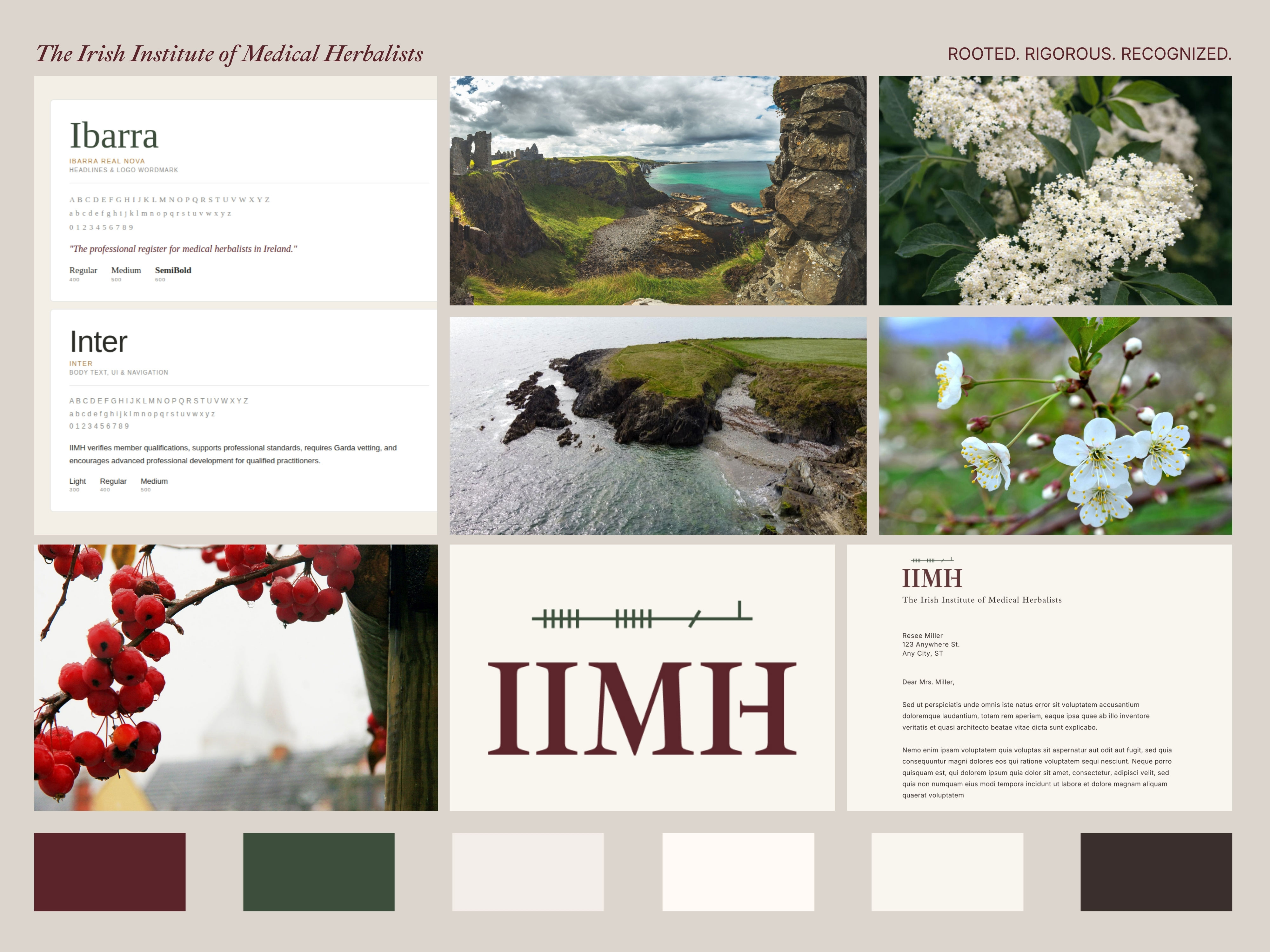
For colour, I deliberately avoided the obvious traps. No shamrock greens. No wellness earth tones. Instead I pulled from the actual Irish landscape: Hedgerow Green, a deep muted tone like a stone wall in November, Atlantic Limestone for the background, a warm off-white that reads as serious rather than clinical, Peat for body type, Amber Resin as a restrained accent pulled from old Irish manuscripts, and Hawthorn Berry, a deep dark red that became the primary brand colour.

For typography, I chose Ibarra Real Nova for headlines and the logo. It has genuine manuscript heritage, carries quiet authority, and holds up at small sizes better than the alternatives. Inter handles all body text and UI, keeping everything clean, legible, and connected to the clinical world the audience lives in.
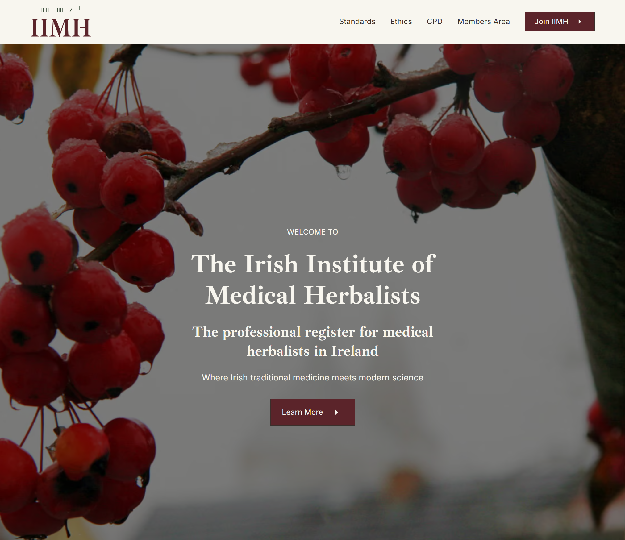
The photography direction was equally specific. Irish native plants in close, clean natural light photography, Hawthorn, Oak, Gorse, Elder. Not styled herb bundles. Not dried botanicals on white linen. Real, named plants in real Irish light. Irish landscape used sparingly, cliffs, ancient wells, stone walls, the kind of images that say something specific rather than something general.
Logo Design
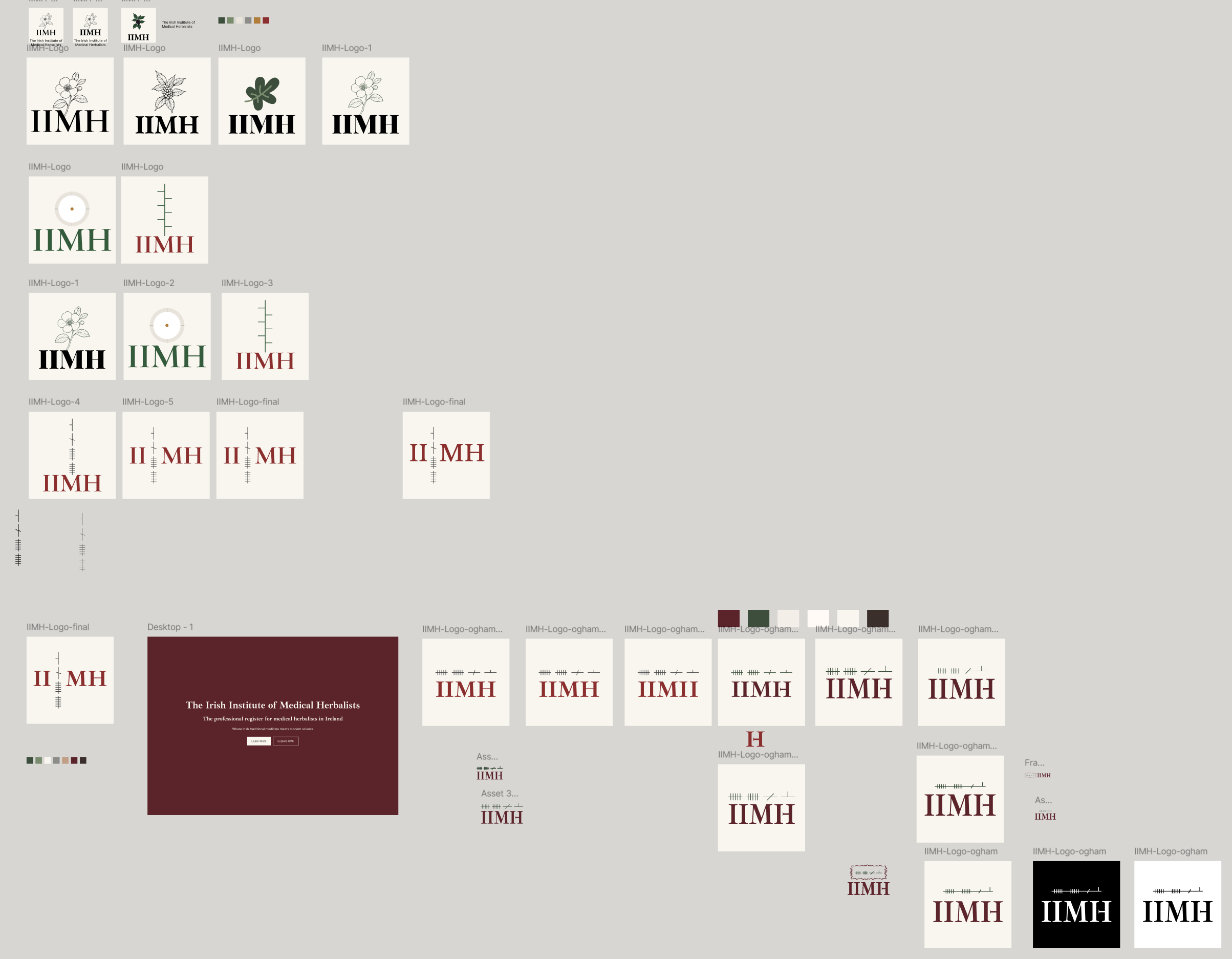
The logo went through genuine exploration before arriving at the final direction. I worked through five distinct concepts: an institutional wordmark, a Hawthorn sprig mark, an ancient well circle, an illuminated manuscript initial, and an Ogham mark.
Ogham won. Ogham is the ancient Irish tree script carved into standing stones, made of horizontal or diagonal strokes crossing a vertical stem. It is the oldest written form of Irish language and carries exactly the kind of depth and specificity the brand needed. Unlike Celtic knotwork or shamrock motifs, Ogham is not decoration. It is language. It is specific. It rewards people who know what they are looking at.
A question came up mid-process from Rosarie herself, who asked about the historical accuracy of writing Ogham vertically versus horizontally. It was exactly the right question. Ogham was carved vertically on stone, reading upward from bottom to top. But in Irish manuscripts it was written horizontally, left to right. For a logo that needs to work at every size across a website, a certificate, a letterhead, and a favicon, the horizontal manuscript form is the correct choice, both historically accurate for the paper and digital context and practically superior for scalability.
The final mark pairs the horizontal Ogham script above the IIMH wordmark in Ibarra Real Nova. The Ogham strokes are in Hedgerow Green. The letterforms are in Hawthorn Berry. An amber accent appears on one of the Ogham strokes as a finishing detail. It is quiet, considered, and completely ownable.
Website Content Strategy
The content needed to remain concise and factual.
The client provided existing copy that focused on:
- Garda vetting
- qualifications
- health insurance
- joining IIMH
- professional standards
- advanced professional development
Rather than adding unnecessary new sections, the content was reorganised into a clearer structure.
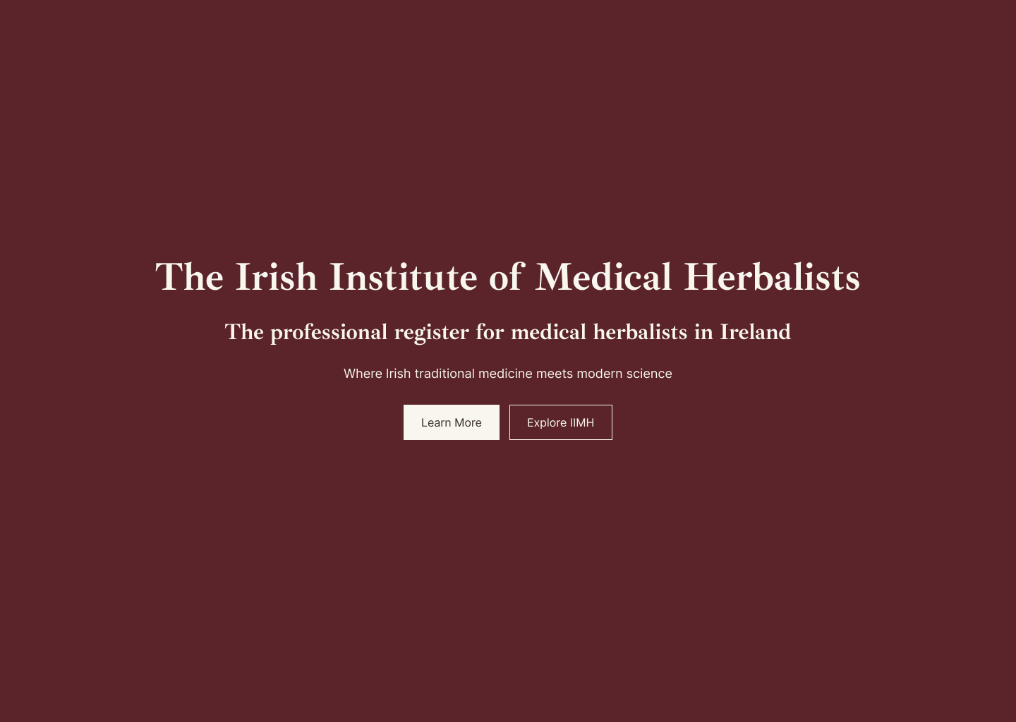
The homepage was designed around the core message:
The Place Where Irish traditional medicine meets modern science
This line became the central statement for the public-facing site.
The supporting sections were grouped around the main credibility pillars:
Garda Vetting
This section explains that all IIMH members undergo Garda vetting, helping address patient concerns around healthcare providers outside traditional biomedical disciplines.
Qualifications
This section explains that IIMH verifies that members reflect an MSc-level standard in herbal medicine or botanical medicine, supported by biomedical expertise.
Health Insurance
This section explains that patients who seek care from IIMH members may be covered by Irish Life health insurance, and that IIMH is actively seeking broader private health insurance coverage.
Contact
The contact section invites visitors to learn how to join IIMH, receive Garda vetting, adhere to professional standards, and engage in advanced professional development.
This approach allowed the site to stay true to the client’s exact content while making the information easier to scan and understand.
Members-Only Page
A password-protected members area was also planned.
This page was designed as a simple private resource area rather than a full membership portal.
The goal was to keep the first phase manageable while still giving IIMH a place to share:
- member news
- selected articles
- clinical resources
- case studies
- CPD links
- professional updates
The members area was intentionally kept static rather than CMS-driven for the initial build. This kept the scope lean and gave the client a simple starting point that could grow later.
Future upgrades could include a CMS resource library, filtered articles, search, member discussions, or a more advanced login system.
Web Design
The site is two pages. A public homepage and a password-protected members area. That constraint, agreed in the initial brief, turned out to be a design strength. Every word had to earn its place.
The homepage is structured around a single question that the primary visitor is asking when she arrives: is this institution credible enough to join? The sections answer that question in order. What IIMH is and why it exists. What professional standards members are held to. The ethical foundation. What membership includes in concrete, practical terms. CPD access. The connection to ICTIM for training. And finally, a clear joining process with a form that accounts for two distinct application paths, ICTIM graduates who apply directly, and graduates of other colleges who complete an entrance assessment as part of the process.
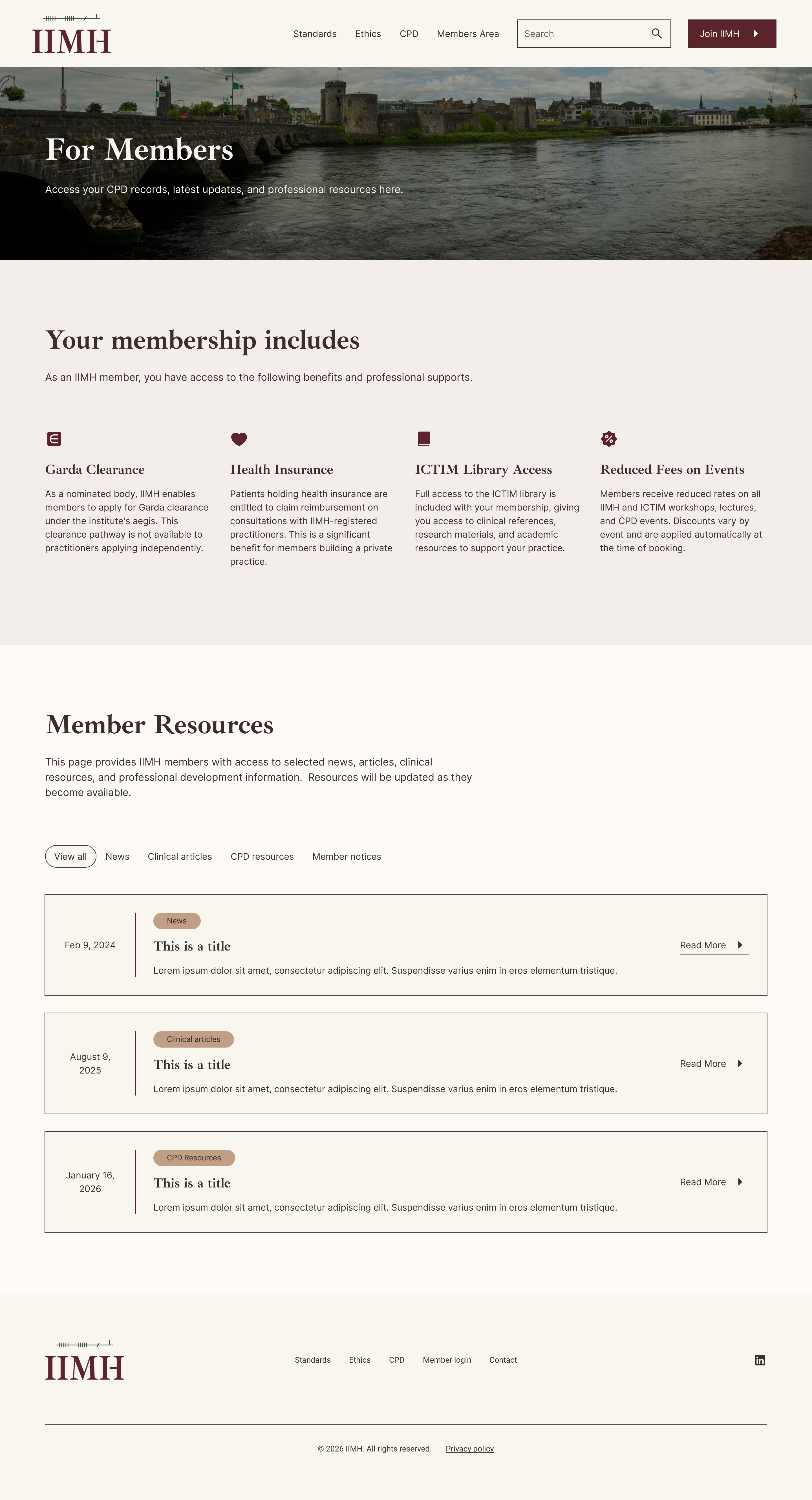
The membership includes section deserved particular attention. It contains four benefits that are genuinely distinctive: Garda clearance through a nominated body pathway not available to independent practitioners, health insurance reimbursement for patients through qualifying insurers, full access to the ICTIM library, and reduced fees on all CPD events. These are not soft benefits. They are clinically and professionally significant.
Design decisions across both pages were guided by one test: would a GP find this credible? Clean lines. Generous whitespace. No decorative elements. No gradients. The ICTIM site was the visual sibling reference throughout, and the IIMH site was designed to feel like a quieter, more settled companion to it.
The old IIMH website was planned to be retired in favour of the new Webflow build. The new site also created an opportunity to link clearly between IIMH and ICTIM, strengthening the relationship between the professional body and the training institution.
Brand Collateral
The Code of Ethics is a full branded PDF, nine pages covering six rules and two appendices, built with Ibarra Real Nova for headings and Inter for body text. The IIMH logo appears in the header of every page. Amber rules separate each section. The document reads as a serious clinical instrument, which is exactly what it is.


SEO & Ecosystem Thinking
Because IIMH and ICTIM are closely connected, the website was planned as part of a broader digital ecosystem.
The IIMH site needed to link back to ICTIM, especially where training was mentioned. ICTIM could also link to IIMH as the professional body or register connected to the pathway.
This cross-linking helps visitors understand the relationship between the organisations and supports organic visibility over time.
The website structure also made space for future member resources and updates, which could help keep the site fresh if IIMH chooses to build out the content over time.
Solutions in action

Outcome
The IIMH now has a brand identity and digital presence that reflects what it actually is: a clinically serious, historically grounded professional register for medical herbalists in Ireland. The Ogham mark is a detail that rewards people who notice it. The colour palette says Irish landscape, not Irish tourism. The typography says institution, not alternative therapy.
The site speaks directly to the primary visitor. It gives her what she needs to make a decision, clear credentials, a named code of ethics, a formal membership process, and a direct link to the training institution she already trusts.
When she tells a colleague about it, she will say: it's the professional register for medical herbalists in Ireland. It looks like the real thing. That was always the goal.
Key Takeaway
IIMH needed more than a visual refresh. It needed a clearer way to communicate its role.
By grounding the brand in strategy first, the design could balance Irish traditional medicine with modern clinical standards. The final direction feels rooted, professional, and credible — exactly the space IIMH needed to occupy.
Are you loving what you're reading? Read more about the Irish College of Traditional and Integrative Medicine and how I built their educational website here.
Love my style? Interested in working with me? Book a free discovery call here and let's chat about your project.
Testimonial

Bernice took on something that wasn't straightforward. We needed a site that looked professional enough for healthcare practitioners but still carried the depth of what Irish herbal medicine actually is. She understood that immediately. The Ogham script in the logo was her idea, and when she explained the reasoning behind it, we knew she had genuinely engaged with what we were trying to do. The site looks like us. It looks serious. That was the whole point.
Bernice was thorough from the beginning. She asked the right questions, she kept us on track when we were slow to get her content, and she never made us feel like we were being difficult. The end result is clean and professional and nothing like the old site. The materials were on brand and every bit is worth it. I love the picture of the Hawthorn berries on the homepage too.
More Projects


If your expertise has outgrown your online presence, let's talk.
A short call — no pitch, no pressure. I will ask about your work and tell you honestly whether I think I can help.
