
From Portfolio to Digital Exhibition: A Scalable Webflow CMS for an Evolving Art Practice

Specifics
About the Client
Elizabeth Page is an artist whose practice is deeply material and intuitive. Her work doesn't begin with a fixed concept — it emerges through exploration, layering, and discovery. The finished piece is only part of the story. The investigations leading up to it are just as much the work.
Her audience spans collectors, curators, and collaborators who aren't just looking for finished images — they're engaging with the arc of a body of work as it comes into being.
Project Overview
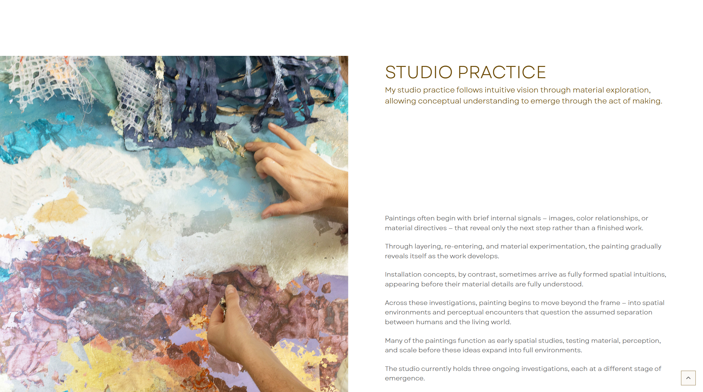
Some work is meant to be experienced, not browsed. When your practice is still evolving, your website should be able to hold that.
Problem Description
A portfolio site would have flattened everything
The standard approach — a grid of thumbnails, project pages, an About section — would have made Elizabeth's work feel like something you scroll past rather than something you enter. The visual logic of a typical portfolio assumes a body of finished work. Elizabeth's practice is inherently unfinished. It evolves.
The real problem wasn't design. It was - how do you translate a non-linear, evolving artistic process into a digital experience?
Solution
Building a digital exhibition system, not a portfolio
Before any design decisions were made, the focus was on understanding how Elizabeth's work actually emerges — how different investigations relate to each other, and how a viewer is meant to move through them. That understanding shaped every structural choice that followed.
Four decisions defined the build:
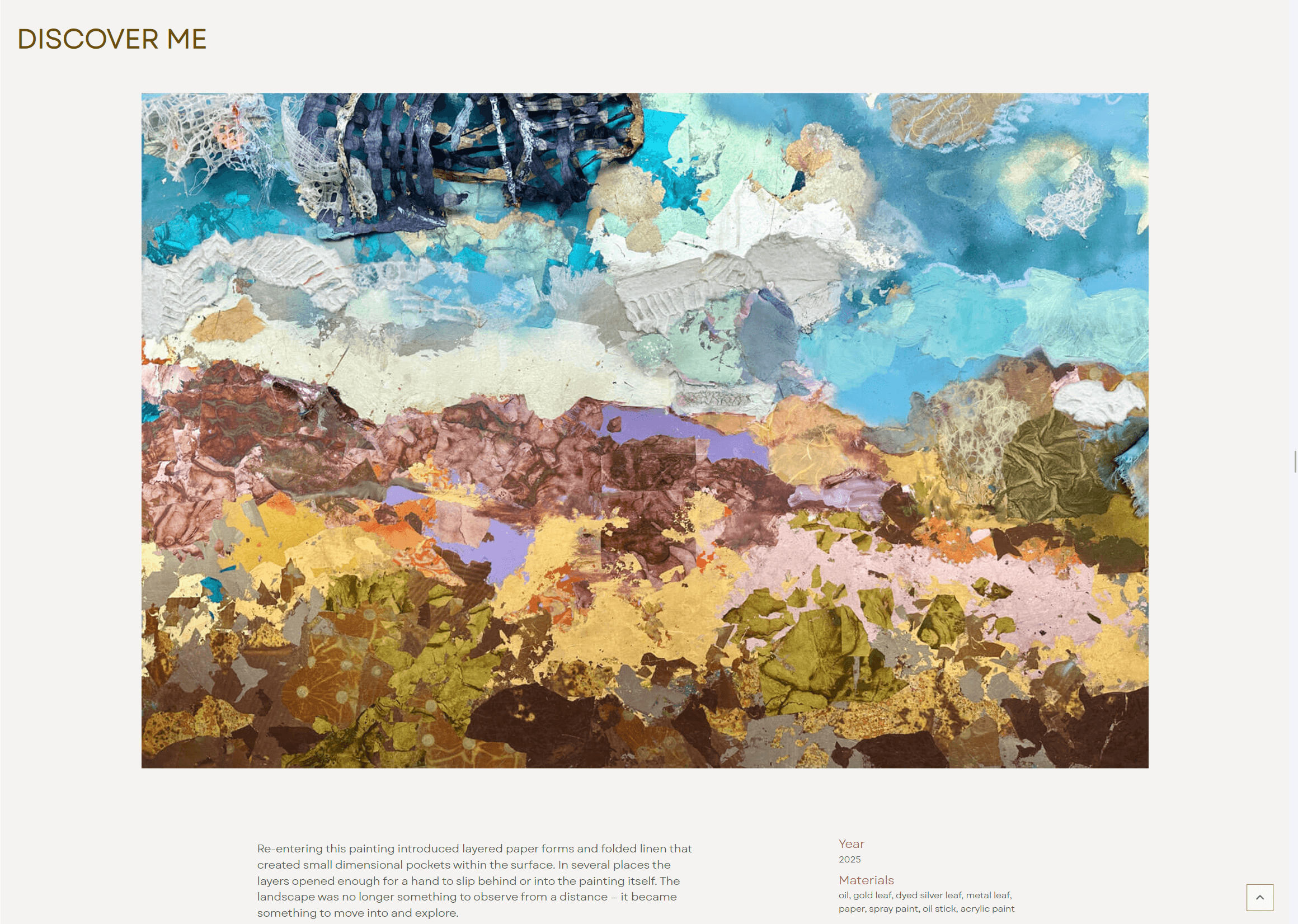
- An editorial, scroll-based experience instead of a gallery grid - Each investigation was designed as a walk-through, not a collection. One work at a time, full-bleed imagery, intentional pacing. The rhythm is built into the scroll itself.
- A CMS built for work that isn't finished yet - The content structure was organized around Investigations, Works, and Material Interludes — so different bodies of work could have different forms, and new work could be added without redesigning the site from scratch.
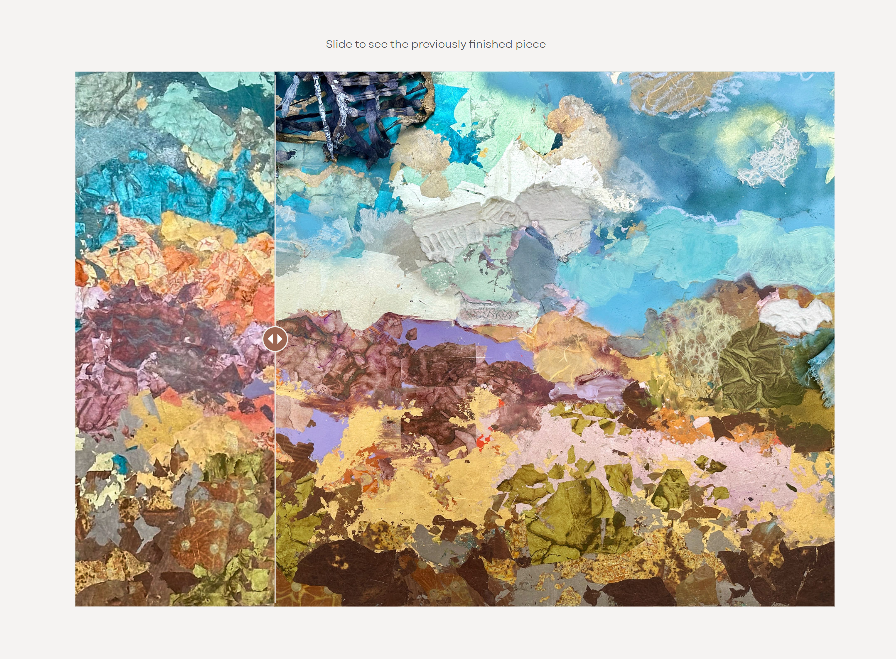
- Space for process, not just output - The site makes room for vision notes, discovery insights, and spatial direction — giving curators and collectors a way into how the work thinks, not only how it looks.
- Minimal interaction design that stays out of the way - Heavy animation would have competed with the work. Instead, scroll pacing creates rhythm, images expand as the viewer moves through, and material interludes act as pauses. The interaction design earns its keep by being nearly invisible.
Solutions in action

Outcome
A site that reflects how the work actually exists
Elizabeth now has a site that can hold evolving, in-process work without feeling incomplete. It presents her investigations as the serious, layered things they are, and it will grow with her practice without needing to be rebuilt.
Most importantly, visitors don't feel like they're browsing a portfolio. They feel like they're entering the work.
Studio Investigations:
- Presents work as evolving investigations, not static finished projects
- Built to grow without redesign as new bodies of work emerge
- Creates an immersive, gallery-like experience online
- Gives curators and collectors access to the thinking behind the work
Testimonial


.png)

If your expertise has outgrown your online presence, let's talk.
A short call — no pitch, no pressure. I will ask about your work and tell you honestly whether I think I can help.
