
Case Study-One Stem, Many Strokes-IIMH
Overview
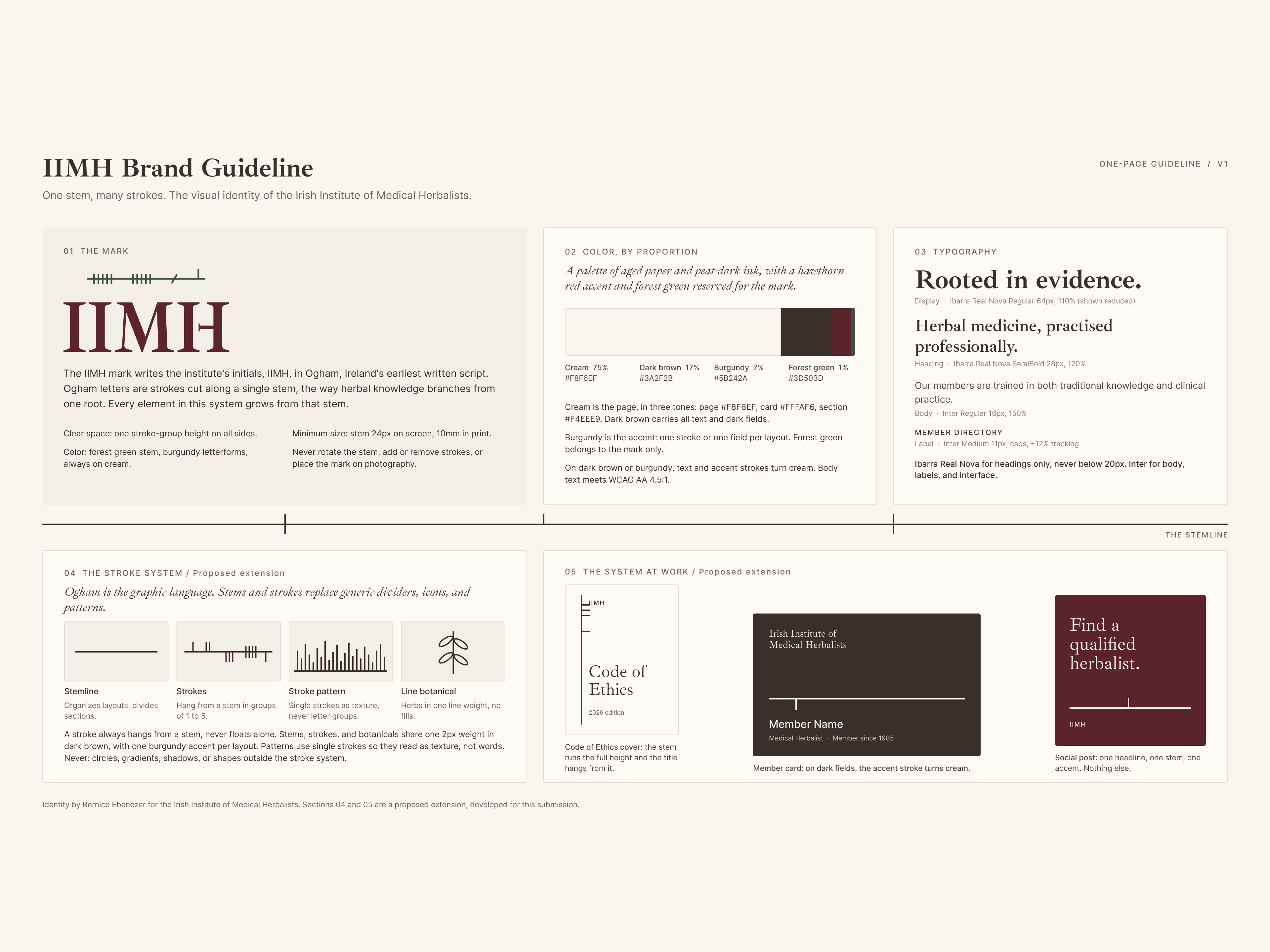
I condensed the visual identity of the Irish Institute of Medical Herbalists (IIMH) into a single page that teaches its own rules. Everything on the page grows from one idea- the Ogham stem in the IIMH mark.
Client: Irish Institute of Medical Herbalists
Original engagement: Brand identity, logo, brand collateral, and Webflow website
My role: Brand designer and developer
Tools : Figma
A note on scope- the mark, palette, and typography come from my identity work for IIMH. The stroke system and applications are a proposed extension I developed for this guideline, to show how the identity could grow into a complete system.
The challenge
Most brand guidelines run 40 pages and get skimmed once. I wanted to test the opposite: could one page hold a complete system and still be clear enough to follow without a designer in the room?That meant three constraints:
• Complete. Logo, color, typography, supporting graphic language, and real applications, all on one page.
• Coherent. Every element had to trace back to the same idea, so the system reads as one voice.
• Checkable. Every rule had to be specific enough that someone could answer yes or no. "Keep it clean and modern" fails that test. "Burgundy is the accent- one stroke or one field per layout" passes it.
The idea- one stem, many strokes
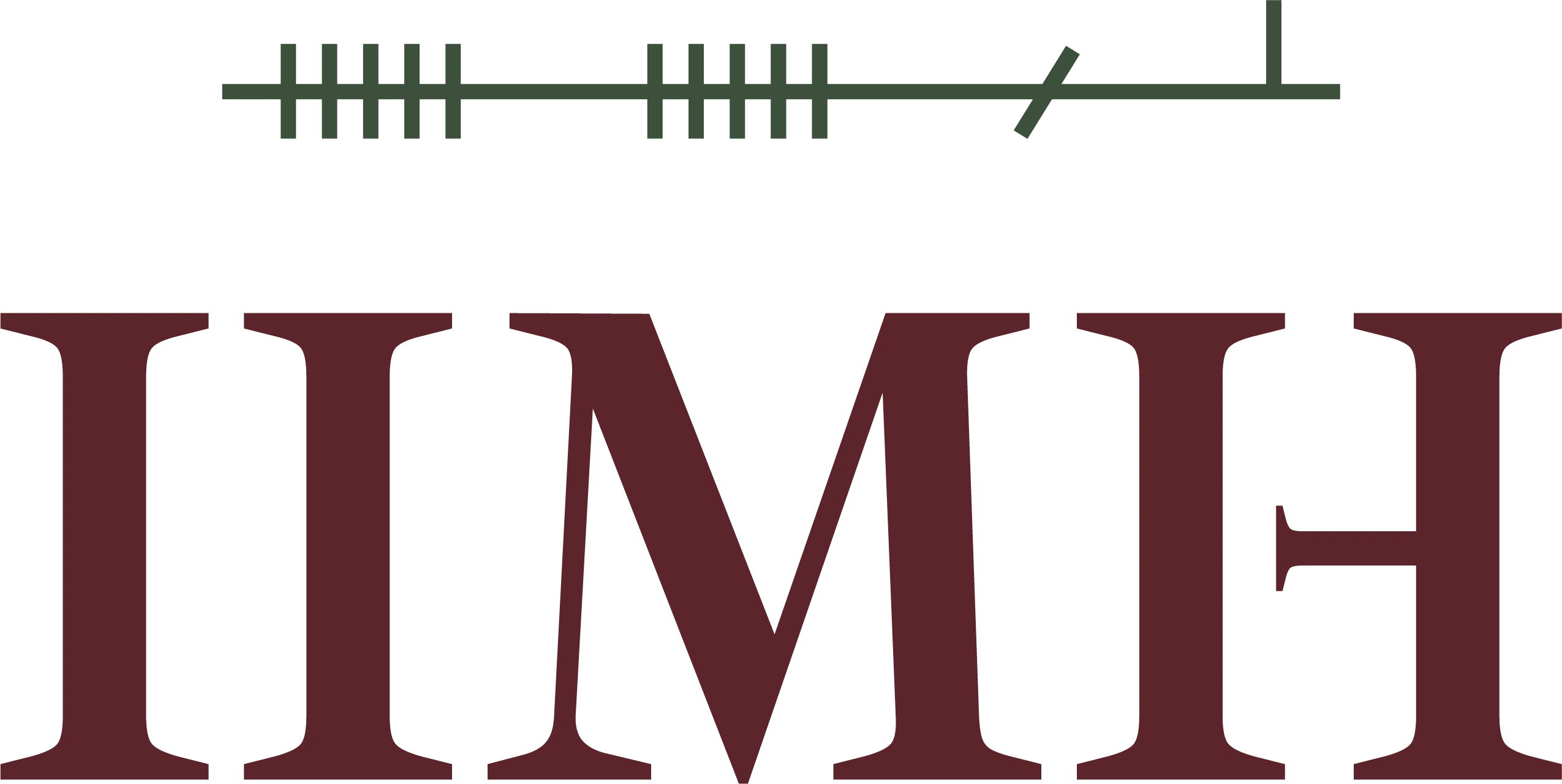
The IIMH mark writes the institute's initials in Ogham, Ireland's earliest written script. Ogham letters are short strokes cut along a single stem line, the way herbal knowledge branches from one root.
So I made the stem the organizing principle of the page itself. A single stem line runs across the guideline, and every section hangs from it like an Ogham stroke. The layout doesn't just describe the system. It demonstrates it.
That gave the page its tagline: one stem, many strokes.

Process
The biggest lesson came early: a guideline should describe how a brand actually behaves, not how it's assumed to look.
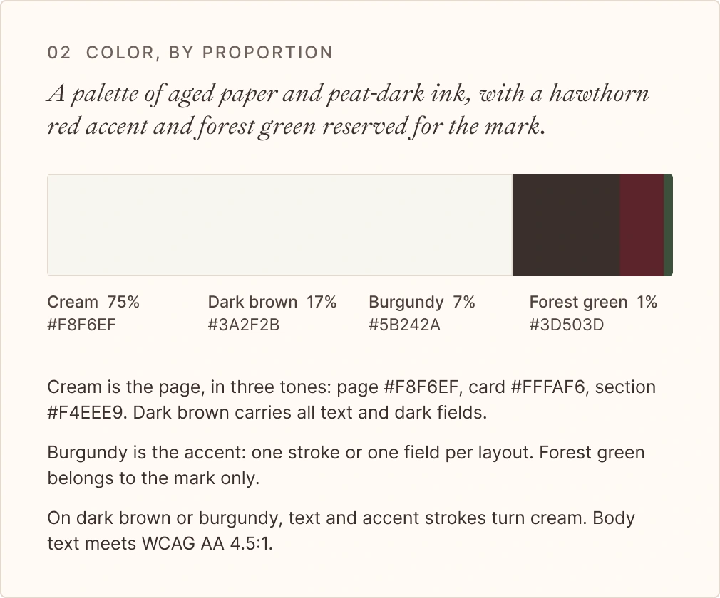
Measure, don't assume. My first draft used placeholder colors. Then I measured the live homepage design by visible area and found a different brand- about two-thirds cream, a dark brown carrying the text, a burgundy accent, and forest green used only in the mark. With photography removed, the brand colors settle at 75% cream, 17% dark brown, 7% burgundy, and 1% forest green. That ratio became the color section.
Clean up before documenting. The design files held near-duplicates- two burgundies (#5B242A and #5B252B) and two greens (#3D503D and #3D4F3C). I consolidated each pair into one value. Three cream tones became a named scale (page, card, and section) instead of three unexplained swatches.
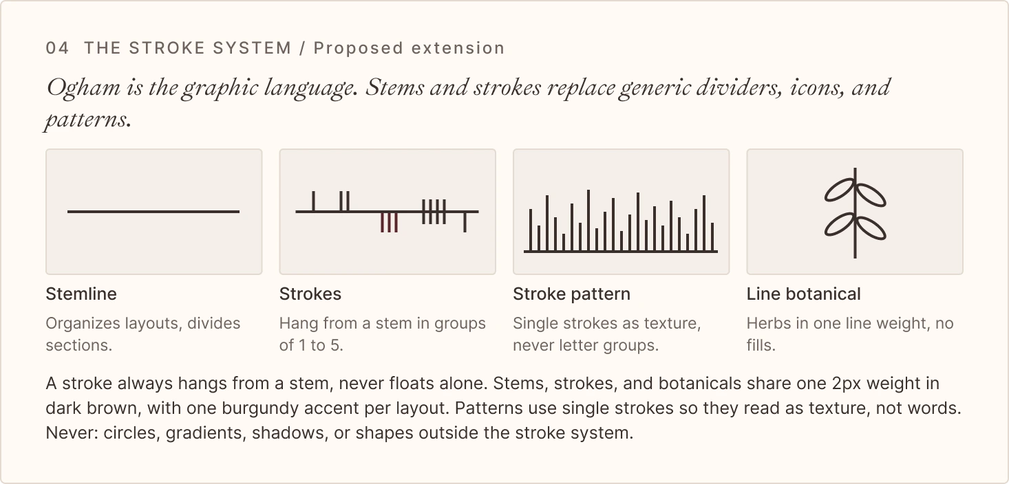
Write rules as tests. I rewrote every rule until it could be checked with a yes or no. For example- "A stroke always hangs from a stem, never floats alone," and "On dark brown or burgundy, text and accent strokes turn cream."
Be clear about what's new. The stroke system and applications are marked as a proposed extension, so the page is honest about what shipped and what's a recommendation.
The system
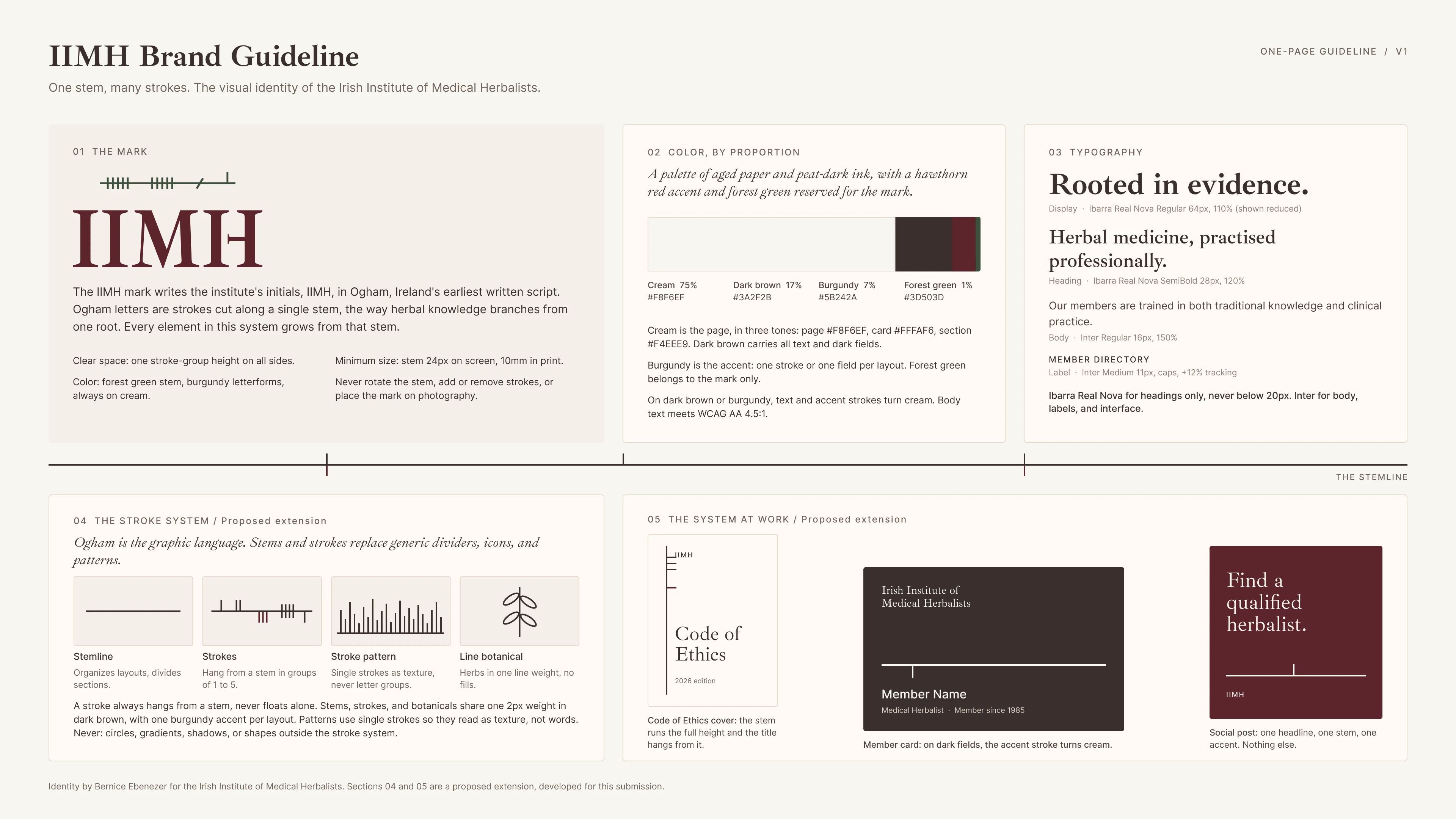
The page is organized into five sections. The first three document the existing identity; the last two extend it.
01 The mark. A green Ogham stem above burgundy IIMH letterforms, always on cream. Rules cover clear space, minimum size, and what never changes: no rotating the stem, no adding or removing strokes.
02 Color, by proportion. Shown as a ratio bar rather than equal swatches, because proportion is what makes the brand feel like itself. Color Hex Share Role Cream #F8F6EF 75% The page, in three tones Dark brown #3A2F2B 17% All text and dark fields Burgundy #5B242A 7% The single accent Forest green #3D503D 1% The mark only
03 Typography. Ibarra Real Nova for headings, with a scholarly, manuscript feel. Inter for body copy, labels, and interface. Each level is shown as a live sample with its spec underneath.
04 The stroke system (proposed extension). Ogham becomes the graphic language - stem lines as dividers, stroke groups as marks, single strokes as pattern, and line-drawn botanicals at the same 2px weight. Patterns use single strokes, not letter groups, so they read as texture rather than accidental words.
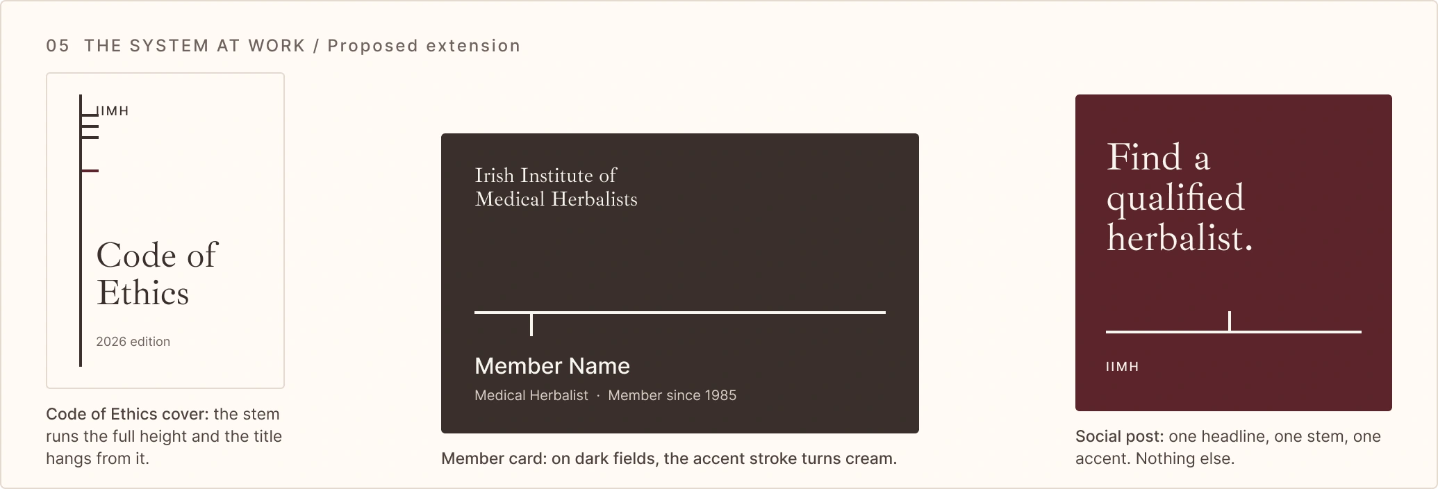
05 The system at work (proposed extension). Three applications built only from the rules above - a Code of Ethics cover where the title hangs from the stem, a member card on dark brown, and a burgundy social post with one headline, one stem, and one accent.
What I took away
A strong identity starts with one idea, and a strong guideline makes that idea impossible to miss. When every element traces back to the stem, it becomes easy to tell what's on-brand and what isn't, whether the person checking is a designer, a client, or an AI tool.
It also changed how I approach guidelines for clients. I now measure the brand as it actually lives before documenting it, and I write rules that can be checked, not just admired.
If you're a practitioner, clinician, or health organization whose brand has grown inconsistent over time, this is the kind of work I love - finding the one idea that holds everything together.
View other interesting posts



If your expertise has outgrown your online presence, let's talk.
A short call — no pitch, no pressure. I will ask about your work and tell you honestly whether I think I can help.
