
What a Landing Page That Actually Converts Looks Like
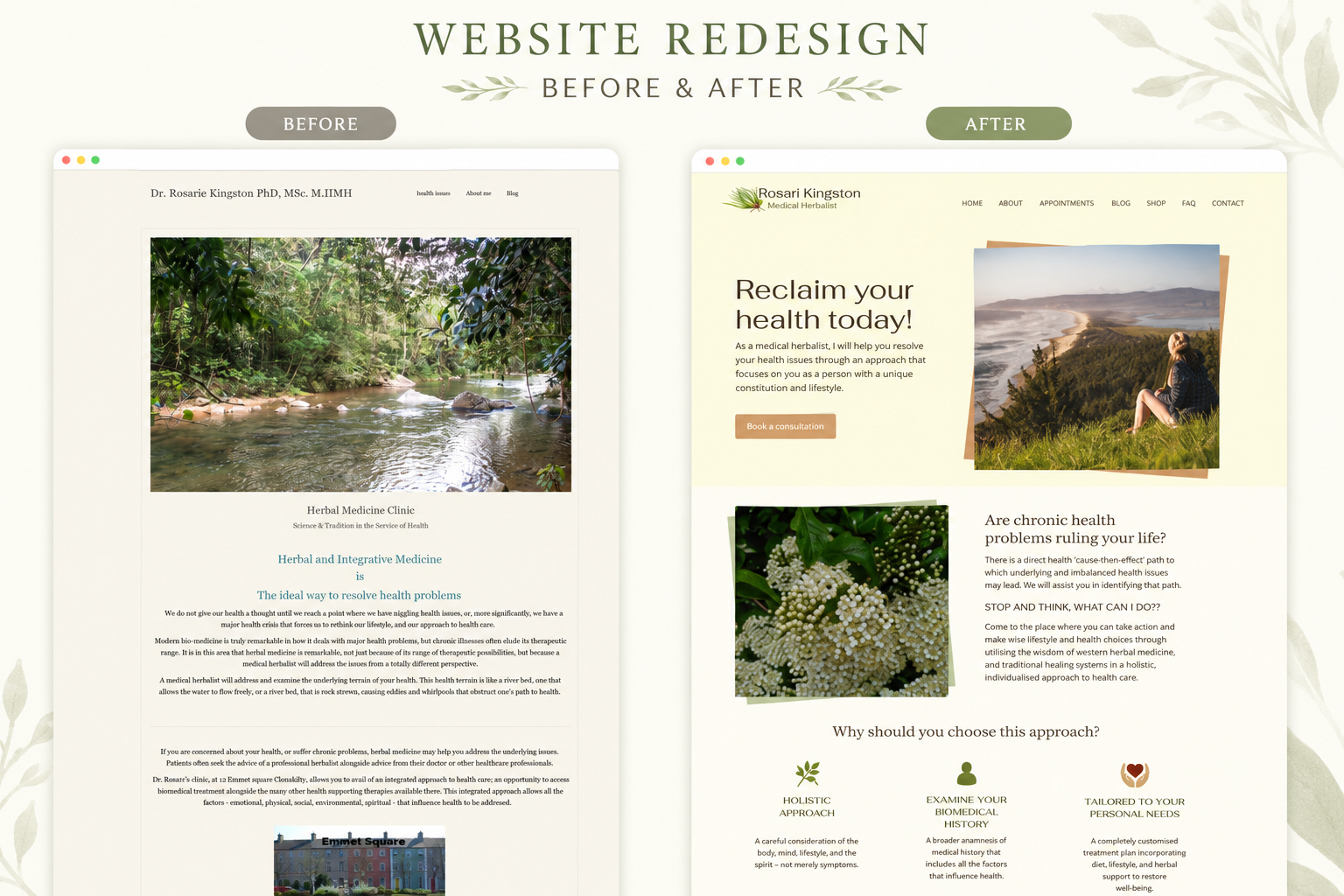
A beautiful landing page can still fail. It may have polished visuals, thoughtful animations, and all the right design trends working in its favour. But if visitors cannot quickly understand what is being offered, why it matters, and what they should do next, the design will not be enough to move them forward.
That is because a landing page is not simply a shorter version of a website. It is a focused conversion experience built around one audience, one offer, and one primary action. Whether you want someone to book a consultation, download a resource, join a waitlist, register for an event, or purchase a product, every section on the page should help that person make the decision with greater clarity and confidence.
There is no single layout that works for every business or every offer. But most effective landing pages contain the same essential ingredients. Here is the recipe I use to think through them.
What makes a landing page different
A traditional website may need to serve several types of visitors at once. It introduces the business, explains multiple services, displays past work, provides resources, and answers broader questions.
A landing page has a much narrower job. It should guide a specific visitor toward a specific action. That means removing unnecessary choices and creating a clear path through the page. Every headline, image, testimonial, benefit, and button should support that path.
Before designing anything, you should be able to answer three questions: who is this page for, what do you want them to do, and what do they need to understand or believe before they will do it. Those answers become the foundation for the entire page.
Ingredient 1: A clear, outcome-led hero section
The hero is the first section visitors see, and it carries a great deal of responsibility. Within a few seconds, it should help someone understand what is being offered, who it is for, what result it helps them achieve, and what they should do next.
One of the most common landing-page mistakes is opening with a headline that focuses entirely on the business. Something like: "We are a full-service consulting company offering innovative solutions." This may describe the company, but it does not give the visitor a compelling reason to continue.
A stronger headline focuses on the outcome the visitor wants. For example: "Turn your expertise into a clear website that helps the right clients trust you sooner." That version immediately tells the visitor what is in it for them.
Your supporting copy can then explain how you help achieve that outcome. In my own case, something like: "Strategy-led website design and Webflow development for solo experts whose online presence needs to reflect the reputation they have already built." The headline communicates the desired result. The supporting copy explains the mechanism.
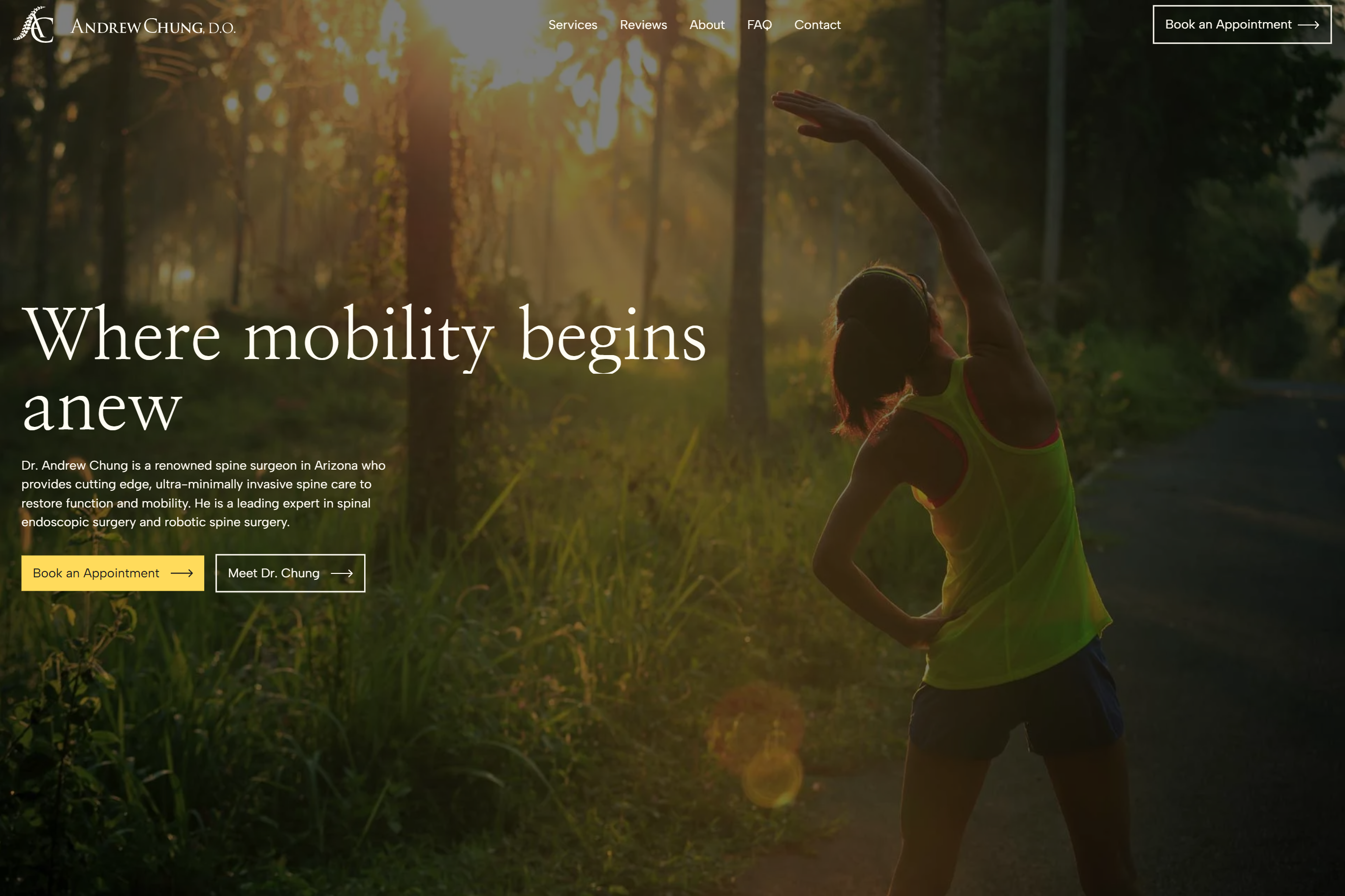
A strong hero section usually includes an outcome-led headline, a short explanation of the offer, one clear primary call to action, a relevant visual, and an early trust signal when you have one. The hero does not need to explain everything. Its job is to give visitors enough clarity and interest to take the next step.
A useful formula to start with is: achieve [desired outcome] without [major frustration or obstacle]. You do not have to use it word for word. It is simply a helpful way to move the focus away from the business and toward the visitor.
If you are still working through your headline copy, my free website copy starter guide is a good place to start.
Ingredient 2: A problem section that makes visitors feel understood
After introducing the outcome, show that you understand what is currently getting in the visitor's way. This is especially important when people arriving on the page are unfamiliar with your business. Before they trust your solution, they need to recognise that you understand their situation.
This section should not exaggerate frustration or try to frighten people into acting. Good problem-focused copy creates recognition, not panic.
For example: "You know your work creates real value, but your current website makes it difficult for prospective clients to see what makes your approach different. The message feels generic, the most important information is buried, and the site no longer represents the level at which you work." This works because it describes a familiar situation in specific, believable language.
Avoid making the problem section too broad. "Are you tired of struggling to grow your business?" could describe almost anyone. Instead, name the actual problem your offer addresses. "Are visitors reaching your website but leaving without understanding why they should choose you?" is far more specific. Specificity helps the right person recognise themselves.
Ingredient 3: A solution that is easy to understand
Once you have described the problem, introduce your offer as the logical next step. This section should explain what the offer is, how it works, and why it is different from the alternatives.
A useful exercise is to break your offer down into its individual parts. A website design service might include brand and website discovery, messaging and content planning, conversion-focused page strategy, custom visual design, responsive Webflow development, CMS setup, SEO foundations, testing and launch, and ongoing support.
Once you can see the offer in detail, you can identify the strongest reasons someone might choose it. Perhaps the real value is not simply that you design websites. It may be that you combine strategy, copy guidance, design, and Webflow development so the client does not have to coordinate several different specialists. Perhaps your process is built for busy solo experts who need structure and guidance without being overwhelmed. Those are meaningful differentiators. They tell the visitor why the way you deliver the service matters.
Ingredient 4: Benefits and value propositions
Landing pages often rely too heavily on features. Features explain what is included. Benefits explain why it matters.
For a custom Webflow CMS, the feature is the CMS itself. The benefit is that the client can update articles, team members, resources, or projects without rebuilding the page. For a strategic discovery process, the feature is the process. The benefit is that the website is built around actual business goals instead of being forced into a generic template. For responsive development, the feature is the technical build. The benefit is that visitors get a clear and professional experience whether they arrive from a phone, tablet, or desktop.
A strong landing page needs both. Features make the offer tangible. Benefits connect those features to an outcome the visitor values. For every feature on your page, ask why it would matter to your ideal client. The answer will usually lead you to the benefit.
Depending on the complexity of the offer, you may need several benefit sections throughout the page. You do not have to squeeze everything into one large block. Group related benefits and give each one enough space to be understood properly.
Ingredient 5: Social proof that is easy to see
Visitors do not only want to know what you say about your offer. They want evidence that it has worked for someone else.
Social proof can take many forms: client testimonials, case studies, before-and-after examples, measurable results, client logos, professional credentials, awards or media mentions, and screenshots or product demonstrations.
A common mistake is hiding valuable testimonials inside a carousel where visitors may never click through to see them. If the proof is important, let people see it. Place testimonials and results near the claims they support. If you are describing your communication process, include a testimonial about how clear and organised the experience felt. If you are discussing results, include evidence of those results nearby.
The strongest testimonials are specific. A testimonial that says "Bernice was wonderful to work with" is positive, but it does not tell a prospective client very much. A more useful testimonial explains the situation, the experience, and the outcome: "Before working with Bernice, our website did not clearly communicate the depth of our services. She helped us organise the message, simplify the user journey, and create a site that finally reflects the quality of our work." Specific proof feels more credible because it helps visitors imagine what working with you could look like.
If you are a newer business without testimonials yet, trust can still be built through a clear explanation of your process, relevant experience, samples of your work, founder expertise, transparent pricing, and answers to important questions. Trust does not come from testimonials alone. It comes from reducing uncertainty throughout the page.
If you want to check how your current website is doing on this front, my post on how to tell if your website is hurting your credibility walks through the signs to look for.
Ingredient 6: A clear process
When visitors are interested but hesitant, the next step may feel larger or more complicated than it actually is. A short process section can make the experience feel manageable.
For example: book a discovery call where you discuss the business, goals, and current challenges. Receive a clear project plan with the recommended scope, timeline, deliverables, and investment. Then build and launch the website with clear checkpoints along the way.
The purpose is not to document every internal task. It is to show the visitor what they can expect. Three to five steps is usually enough.
You can read more about how I structure my own process from first call to launch.
Ingredient 7: Answers to fears, uncertainties, and doubts
Even when someone wants the result you are offering, unanswered questions can prevent them from acting. They may be wondering whether this is right for a business at their stage, how long it will take, what they will need to provide, what happens after they enquire, whether they will be able to update the site themselves, or what happens if the project turns out not to be a good fit.
These questions represent the natural friction involved in making a decision. Your landing page should not avoid them. It should answer them directly.
You can reduce uncertainty through an FAQ section, a clear guarantee or policy, transparent process information, pricing guidance, delivery timelines, examples of who the offer is and is not right for, and an explanation of what actually happens after someone clicks the button. The goal is not to remove every possible concern. It is to answer the concerns most likely to prevent the right visitor from moving forward.
Ingredient 8: One clear call to action
A focused landing page should have one primary conversion goal. That does not mean the call-to-action button can appear only once. It means the buttons throughout the page should guide visitors toward the same next step, whether that is booking a discovery call, downloading a guide, joining a waitlist, or registering for a workshop.
Avoid vague button labels. "Learn more," "Submit," "Get started," and "Click here" tell the visitor nothing useful about what comes next. Tell them what will happen when they click.
"Book your free consultation" is clearer than "Get started." "Download the guide" is clearer than "Access it here."
The best location for the call to action depends on the complexity of the offer. A simple or familiar offer may convert near the top of the page. A higher-investment or unfamiliar service will usually require more explanation and proof before visitors are ready to act. This is why it is useful to repeat the call to action at natural decision points throughout the page: in the hero, after explaining the offer, after providing social proof, and near the bottom. Each appearance should feel like a logical next step, not an interruption.
Design should support the message
Once the content and structure are clear, design can make the message easier to absorb. This is why I work copy-first.
Starting with design often creates pressure to force the content into an attractive layout. Starting with the message allows the layout to be built around what visitors actually need to understand.
Every visual decision should serve the message, not the other way around.
If you want to understand how I bring strategy, brand, and design together in practice, my post on how I approach brand identity and web design covers the full picture.
Good landing-page design creates hierarchy. It shows visitors what to read first, which information belongs together, what is most important, where to look next, and what action to take. Headings, spacing, colour, imagery, and contrast should all be used with intention. A visitor should be able to scan the page and still understand its central argument.
Avoid adding sections merely to make the page feel substantial. A short, focused page can outperform a long one when it gives visitors everything they need to decide. At the same time, do not make the page artificially short because you are worried people will not read. Interested visitors will read when the information is relevant and easy to navigate.
The goal is not to create the shortest possible page. It is to remove unnecessary information while keeping everything that supports the decision.
The order should follow the visitor's questions
A strong landing page often follows a sequence similar to this: what is this and what will it help me achieve, is this meant for someone like me, do you understand my current problem, how does your solution address it, why is this approach different, has it worked for others, what exactly do I receive, what happens next, what risks or concerns should I know about, and how do I take the next step.
This is more useful than treating landing-page design as a checklist of fashionable sections. The page should feel like a well-organised conversation where each section answers one question and creates a natural reason to continue.
Common landing-page mistakes
Before publishing a page, it is worth checking for a few things I see regularly.
- Leading the headline with the business name or description rather than the result the visitor wants.
- Trying to speak to everyone instead of addressing one defined audience and one specific need.
- Offering too many next steps so visitors have to decide where to go rather than whether to act.
- Designing before clarifying the message, so the page looks polished but still lacks a convincing flow.
- Listing features without connecting them to a meaningful benefit.
- Hiding strong testimonials or results in carousels instead of making them easy to see.
- Avoiding difficult questions so that unanswered concerns become reasons to leave.
- Using vague calls to action instead of telling visitors exactly what they are stepping into.
A simple landing-page checklist
Before launching, it is worth asking:
- Is the page built for one recognisable audience?
- Does it have one primary conversion goal?
- Can visitors understand the offer within a few seconds?
- Does the headline focus on an outcome they want?
- Have I described the problem in specific language?
- Are the benefits connected to real needs?
- Is the offer easy to understand?
- Have I included visible proof?
- Is the process clear?
- Have I answered the most important objections?
- Are the calls to action specific and consistent?
- Is the page easy to scan on mobile?
- Does every section help the visitor make a decision?
If a section does not improve clarity, build trust, or support action, it is worth reconsidering whether it needs to be there.
For a free companion resource focused on your homepage specifically, you can also download The Ultimate Homepage Checklist.
The goal is not perfection. It is clarity.
There is no universally perfect landing page. The right page depends on the audience, the offer, the source of the traffic, the level of investment, and how much trust already exists.
But the strongest landing pages tend to do the same fundamental things well. They communicate a desirable outcome. They make visitors feel understood. They explain the value of the offer. They provide believable proof. They reduce uncertainty. And they make the next step feel clear.
Design can make the experience memorable, but clarity is what makes the experience work.
If you are planning a landing page and are not sure how to structure the message, get in touch or take a look at my services. I can help you turn your offer into a clear, strategic Webflow experience that guides the right visitors toward action.
View other interesting posts



If your expertise has outgrown your online presence, let's talk.
A short call — no pitch, no pressure. I will ask about your work and tell you honestly whether I think I can help.
