
What a Spine Surgeon Needed From a Website (That Most Designers Would Have Missed)
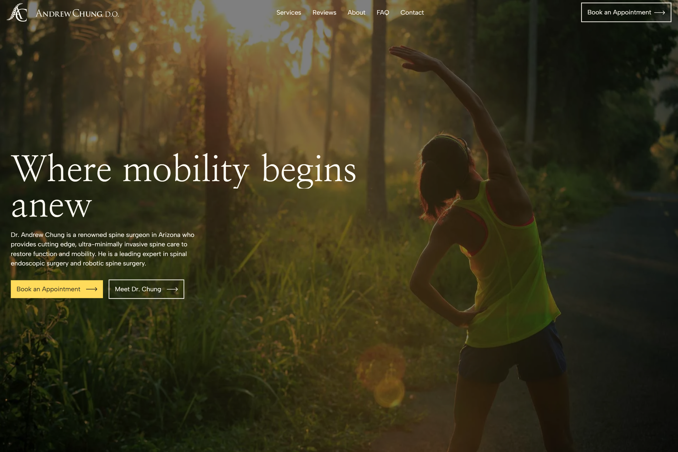
When Dr. Andrew Chung came to me for a website redesign, the brief looked straightforward on the surface. His existing site was outdated. It did not look the part. It needed to be modernised.
But the more I learned about his work, the more I understood that aesthetics were the least interesting part of this project.
Dr. Chung is one of very few dual-fellowship trained spine surgeons in Arizona, having trained with both world-renowned neurosurgeons and orthopaedic spine surgeons. He specialises in ultra minimally-invasive, non-fusion, and outpatient spine surgical techniques. That is a level of precision and clinical depth that most patients searching for a spine surgeon will not immediately understand, but absolutely need to trust before they will book.
That is the brief most designers would have missed.
The old site was doing him a disservice
The existing website had information on it.
It listed services.
It described procedures.
But it had been built without a clear understanding of how patients with spinal conditions actually search, read, and make decisions.
The design felt dated and clinical in a cold way rather than a confident way. It did not perform well on mobile, which matters a great deal when you consider that most people searching for specialist care are doing so on a phone, often when they are in discomfort, often when they have already been through several rounds of treatment that did not work.
The content structure assumed the patient already understood the treatments on offer. It did not meet them at the point of their pain and walk them toward the right option. And it did not communicate what makes Dr. Chung genuinely different in a way a patient could understand in the first thirty seconds.
What most designers would have done
A generalist designer handed this brief would likely have focused on making the site look better. Cleaner layout. Better fonts. Updated colours. A more modern feel.
That would have been an improvement in the wrong direction.
A spine surgeon's website is not a portfolio piece.
It is a clinical trust mechanism.
The patients arriving at that site are often dealing with chronic pain. Many of them have already seen multiple doctors. Some have had procedures that did not help. They are not browsing casually. They are looking for someone they can trust with something that has been affecting their quality of life, sometimes for years.
What the site needed was not a new coat of paint. It needed a complete rethink of how it communicated, structured, and converted.
What I actually built, and why
The work covered brand development, a full website redesign, Webflow development, and a CMS architecture built to grow with the practice.
The first thing I focused on was making Dr. Chung's exceptional credentials feel legible, not just impressive. Dual-fellowship training with both neurosurgeons and orthopaedic spine surgeons is genuinely unusual. It is a distinction that matters clinically and matters to patients who have not found answers elsewhere. But it is easy to bury that in a wall of medical language that patients skim past without registering.
I restructured the content so that this distinction was front and centre, explained in plain language, and connected directly to what it means for the patient: that Dr. Chung can offer approaches that a single-specialty surgeon might not consider.
Mobile responsiveness was not a checkbox. It was a core design decision. Patients searching for spine care on a phone are often not in a comfortable position to scroll through dense content. The mobile experience had to be fast, clear, and lead quickly to a way to get in touch or find the right procedure for their situation.
I also reorganised the content structure around how patients actually think. Rather than leading with procedure names that a patient may not recognise, the site was structured to help someone understand whether they are in the right place and what Dr. Chung can offer for their specific situation, then move naturally toward the next step.
The CMS I built in Webflow allows the practice to add new content, update procedure information, and expand the site as the practice grows without needing to involve a designer for every change. For a specialist practice that is continuously developing its offering, that kind of flexibility is not a luxury. It is a necessity.
What Dr. Chung said
Dr. Chung left a testimonial that I find genuinely hard to improve on:
6 stars if I could. Incredibly responsive, skilled, meticulous, and prompt in her work. She went above and beyond at every milestone, and despite my pickiness and frequent lack of responsiveness, she was always so patient and gracious with me. In short, she is the whole package, and has my highest recommendation. Hire her with complete confidence.
That last part, "hire her with complete confidence," is the kind of outcome I am always working toward. Not just a site that looks good, but a working relationship where the client feels genuinely looked after.
What this project confirmed
Every specialist medical project I take on teaches me something specific. With Dr. Chung, the clearest lesson was this:
The technical excellence of a surgeon's work is almost impossible to fully communicate on a website, and yet the website has to make a patient feel that they are in safe hands before they ever pick up the phone.
That is not a design problem.
It is a communication problem, a structural problem, and a trust problem.
Getting it right requires understanding the clinical world the practitioner works in, not just the visual conventions of medical websites.
I wrote about this in more depth in my post on what a specialist physician's website actually needs to convert patients if you want to go deeper on the architecture and SEO thinking behind this kind of work.
If you are a specialist practitioner with a website that no longer reflects your expertise
You can view the full Dr. Andrew Chung case study here and the live site here.
If the work resonates with where you are, here are three ways to take this further.
Book a free discovery call. We talk about your practice, what your current website is and is not doing, and whether a redesign is the right next step. No pitch, no pressure. Book a call here.
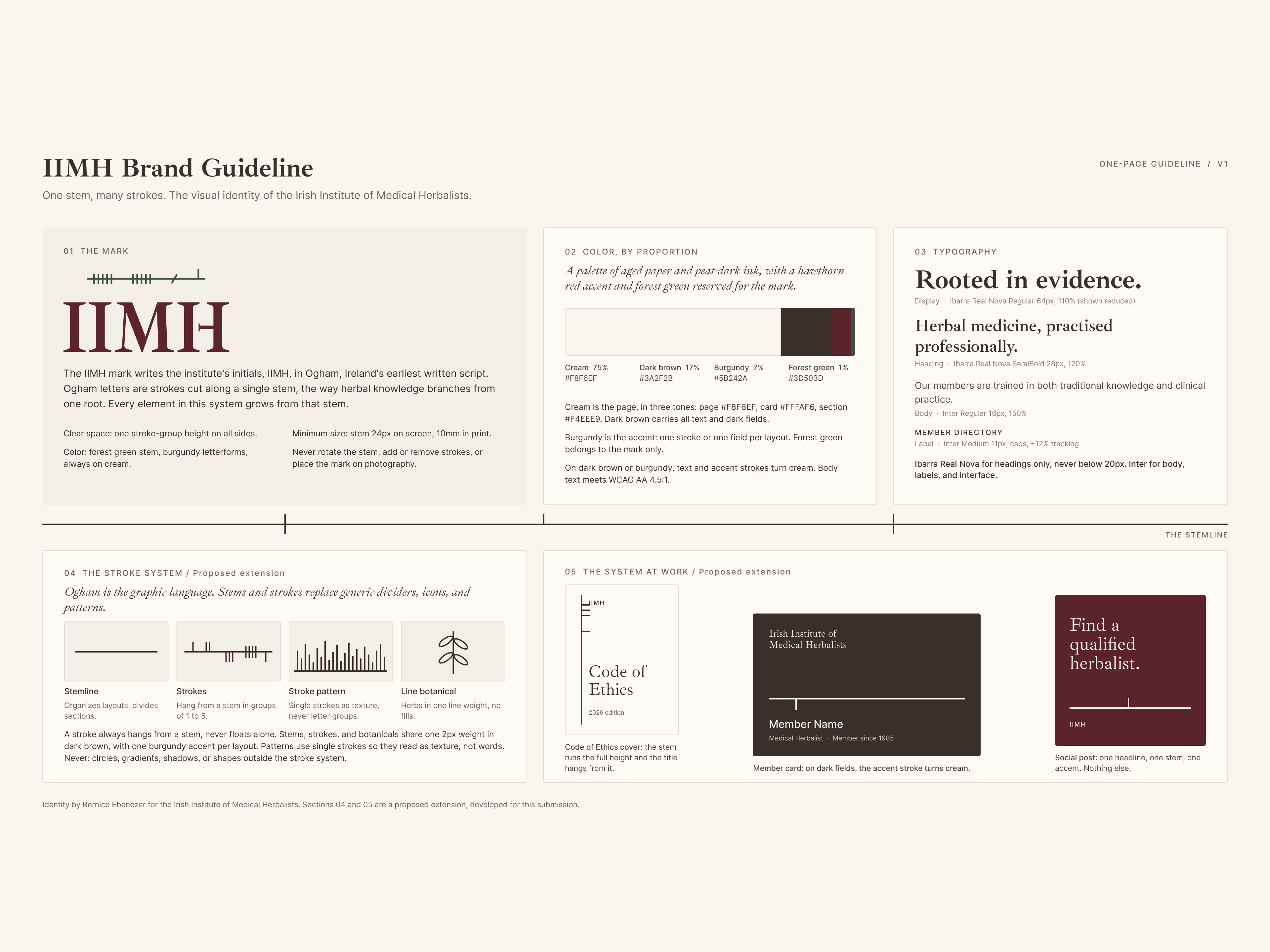
Read about my work with the Irish Institute of Medical Herbalists. A different kind of project, building a professional register and a public-facing site for a medical body, but the same principle at the heart of it: understanding the world your audience lives in before touching a design tool. Read the case study.
Take a look at how I work. If you want to understand my process before we speak, my services page covers the full picture.
Your patients are choosing based on trust. Your website should be earning it.
View other interesting posts

If your expertise has outgrown your online presence, let's talk.
A short call — no pitch, no pressure. I will ask about your work and tell you honestly whether I think I can help.
